Showing posts with label red. Show all posts

Friday, 26 April 2013

Grocery shopping, the artist's way


Yesterday after work, I found myself in the supermarket trying to do the shopping for next week's lunches. I was totally uninspired, circling around and around the section, trying to decide what I would want to cook. The only condition was that it had to be food that I could keep till Sunday. At one point I found myself staring at the huge variety of tomatoes. It's amazing how the choice has increased over the past few years, when there were only about two, or three at most, varieties of tomatoes available. I was especially fascinated by a big huge tomato that looked a bit like one of those pumpkins. They were ridiculously expensive, but I thought it would just be perfect to sketch and paint, and so I decided to get just the one.


The addition of the tomato still didn't solve my problem of what vegetable to get to go with the potatoes and fennels I already got. I decided to go for the good old carrot. While steering towards the big box of carrots, I remembered having seen some of those yellow ones not too long ago. Now wouldn't yellow carrots be nice to sketch too, and make a much better page in my sketchbook together with my special tomato? Yes, they had yellow carrots, and I happily made my way to the tills, having not only sorted out my lunches, but my an evening of sketchign too.


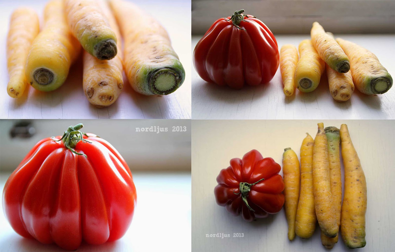
It was one of the rare sunny days yesterday, so I took the chance to take some photos of my veggies on the window sill, before sketching them. It's been quite a while since I've done some proper photography other than landscape shots while out walking, and I really enjoyed snapping my tomato and carrots from all sides (hence the slight photo overload in this post).


Then on to sketching them. I decided to use my new square watercolour sketchbook I had found recently in an art shop here (and let me tell you, sketchbooks with real watercolour paper are hard to find here). It's 25x25cm, which is a good size to work with at home, and it's square, which I always like. I made the sketches using a pencil first, then going over with a pen.


Adding colour. I really enjoyed getting out my proper, expensive watercolour paints again. I even went so far as to leave out white spaces for the highlights on the tomato, instead of going over with white gouache or a gel pen to add them later, as I usually do.


I meant to have the tomato for dinner, but it was getting a bit late, and I didn't want to use a photo as reference but the real thing for adding the colour, to get all the highlights and shadows more or less right. Photos are very useful to use for painting, but it's always nicer to have the real thing, so I ended up not having it. The sacrifices we make for the sake of art...


I haven't quite decided yet if it's finished or not, but I think I'll probably leave it as it is. And I'll have to find some more interesting vegetables or fruits to sketch. And I'm looking forward to a lovely tomato dinner when I get home tonight.

Linking this up to the delicious Paint Party Friday

Monday, 16 July 2012

Back home again

Back home again after a great 2 1/2 week's holiday in England, where, with the Queen's jubilee earlier this year, and the Olympic games later this month, virtually everything is blue, red and white.


I had taken some water soluble coloured pencils with me to work in my storyboard sketchbook, but I wasn't happy with the pencils, so instead I went to my  favourite art shops in London and bought some paints, stains, inks, stamps... and started a new sketchbook/art journal. Staying in a student hall room without telly for the first 10 days, I happily spent some of my evenings collaging and painting away. With all the Union Jacks, or Union Flags (as it is usually called Union Jack only when at sea, although there seems to be some debate about the whole name business), and with having just purchased some red, white and blue paints, a Union Jack/Flag naturally had to go into my sketchbook.

I had the paints, a couple of brushes, and a water glas, but I hadn't really thought about a palette to mix my colours. A simple plastic carrier bag worked perfect as substitute palette.


I found some Liquitex soft body paints in one (and only that one) of the art shops in London. I really like them, they're perfectly smooth and creamy, but not too soft and runny. I just wish I could have bought more of them, as I haven't seen them anywhere here in Switzerland. But there's a limit to how many tubes of paint you can squeeze into a suitcase.

Friday, 8 June 2012

Preparing for change

I bought a new art journal and have started to paint the covers in the evenings after work, to make it more personal. I meant to use my at the moment favourite colours, purple and green. But after having completed a first green layer, I just had to add some orange and red the following day.


It is actually already looking different again, as I've been working on it some more. I just didn't manage to take new photos yet. A lot of the red and orange has been covered up again with different shades of purple and some blue. And I've added some patterned paper too. 


To continue working on these covers, and to keep changing them until it all feels right is actually very appropriate for this particular art journal. Because this journal will be all about change. I've been thinking a lot about change recently, big and small, wanted and unwanted. About all the changes I want to make in my life, about how to turn negative, because unwanted, change into positive opportunities, about attitude towards change and how to influence it. It feels like now is the right time to start and make some changes. Maybe not start with all those big, scary but also exciting ones, and not everything at once. But at least start taking the first steps. Sit down with a journal and make some notes, turn the one or other little idea into action, put your mind to it, and get the focus and attitude right. And believe that everything will turn out okay somehow. And make lots of inspiring and encouraging and most of all honest and authentic art journal pages on the way.


Linking this up with the wonderful Paint Party Friday, a truly inspiring community.

Thursday, 31 May 2012

A trip to the north

I've spent 10 days in the beautiful city of Hamburg last week. It was my first time up there in the northern part of Germany. Have you ever been there? It's totally worth a visit, and definitely not my last time up there! I spent four of the 10 days there at a conference, but still had enough time to explore the city and even take a couple of day trips outside the city. Of course, being so close to the coast, I just had to see the sea. There was just one question: North or Baltic Sea?


The Baltic Sea was closer and more convenient, so the Baltic Sea it was. I took the train to the little town of Travemünde, and, when I arrived there, was overjoyed to see a whole big sandy beach full of Strandkörbe ("beach baskets"). Those Strandkörbe are typical of North Germany's North and Baltich Sea beaches, and while I had seen a Strandkorb as such before, I had never seen one actually standing on a beach. I don't know how many photos I took of them. They just made me happy :).


Of course I didn't just take photos of Strandkörbe, but I just wanted to quickly share these with you. It's a busy week, my suitcase is still waiting to get unpacked, and I will need a little bit more time until I'm fully back, and present in blog world.


I was glad to see that my blog post scheduling worked perfectly last week, and that my two posts were published as intended. But I must admit that I didn't really think about the fact that it all gets a bit onesided, especially as I didn't have any internet access. So I'll have a bit of catching up to do. I'm really looking forward to visit everyone's blogs. I'll just need a bit of time. But I'm back. And it feels good :)

Friday, 13 April 2012

Red phase tea inspired (?) wip

I LOVE my art journal. But the problem with my art journal is that it  tends to keep me away from easel and canvas. But during the Easter weekend, I finally found enough time and energy to tackle the 70x70cm canvas that has been waiting patently in the corner for weeks. I had a hundred ideas in my mind, and none of them included any red. But somehow, I ended up picking up the brighest reds in my paint box. And it felt fabulous and right.


Close-up/detail: I love the texture of the canvas and how building up layer after layer creates more texture.


I must admit that my water jar always fascinates me. How you start with fa jar of fresh clean water, which then slowly adopts all the beautiful colours (and turning into some muddy brown) until being washed down the drain. Isn't this just a beautiful lush red? Like freshly squeezed raspberries.


My palette is now covered in reds. The gorgeous Alizarin Crimson gives a beautiful lighter colour when mixed with white, without turning too pink. I still haven't cleaned my palette, and it is now rather bumpy. Not really ideal for working with a roller.


I added a layer, or rather a few layers, of white on top of it all at the end, because it was all getting a bit too much red. I like the aged, worn look this added.


Still a work in progress, but now I'm not quite sure yet how I want to proceed. I have a few ideas but I'll have to meditate on them and wait what'll come out at the end. I've also very briefly considered just leaving it as it is. But I don't think I have to heart to do so. Not because I don't like it, but because it makes me feel guilty. I always feel that if you want to create a piece of art, it needs a bit more to justify it as such than just slapping on one or two layers of paint on a canvas and scraping it around a bit. And all of that in less than a hour. I think that you have to "slave" at least a little bit over a piece to earn it the name of "artwork". And up till now, it has definitely been to much fun and not enough slaving.

So maybe something with white and light green. This combination just screams spring to me, and all I want to do at the moment is having everything around me in white and light green.

Hmmm, I really wonder where this "red phase" is coming from then. I have a slight feeling though that it might be the influence of a new tea I bought the other day. Pomegranate and Raspberry infusion. Delicious! And the colour is just irresistible. Or maybe it's the strawberry & raspberry sorbet I'm totally addicted to at the moment.


Friday, 3 February 2012

Paint Party Friday 47*5 ~ when is it finished?

My "lollipop" trees are finished. Or so I think. At least for the moment. (And I promise this is the last time I'll post them here).

While I liked the patterns and colours, I just wasn't 100% happy with it. It didn't feel right yet. So I added a layer of white over it, but it was still not right. At the end, I used some oil sticks and generously went over it all, adding a creamy layer while allowing some of the patterns of the layers of acrylics underneath to show through.


It's hanging in the living room at the moment, and I keep looking at it, adding/adjusting a little bit here and there, and thinking about whether to add some shadows or not. It's not always easy to know when a painting is finished.

I went to see the documentary film "Gerhard Richter Painting" at the cinema (watch a extract here) in my Christmas break. Richter often lets his paintings hang for some time between each step, before deciding what to do next, letting them evolve, and often changing them completely in the process. At one point, the film maker asked ihm to explain when /how exactly a picture was finished. He tried very hard to give her a satisfying answer. She wanted a straight, logic explanation, and he simply couldn't give it.

I could understand his struggle. When is a picture finished? In my opinion, or rather personal experience, there are two possible ways to finish a painting:

  1. You paint until you come to the point when it simply doesn't need even one single brushstroke anywhere anymore. It simply is just finished, and you know it. You hold it up, look at it from a little distance, satisfied, smiling, and you say to yourself "yes, it's finished".
  2. You simply don't know what to do next. You pick up some paint, you are about to put the brush on to the canvas, then you hesitate. No, not there. Maybe here? No. Maybe with another colour? No. After a while, you just put down your brush, look at your painting long and hard, shake your head, and mutter to yourself, "well, I think it's finished then".

Sometimes, the second can result in the first, after some re-working or over-painting after some time. But at the end, you can't really explain when a painting is finished. It's a process, which sometimes can take weeks, months, until you come to the point when you just know, one way or another, that it's finished.

How do you know when a painting is finished?

Happy Paint Party Friday!

Thursday, 2 February 2012

On my palette ~ hands-on creaminess

There isn't so much an actual physical palette this week, instead, the palette consists of three oil)paint sticks. They can be applied directly on to the canvas, and then worked and moved around with one's fingers, so  they don't have to be mixed on a palette, or taken up with a brush from a palette. Although they can be used with brushes as well, just like paint out of a tube or pot (although I haven't tried that yet, painting with one's fingers with them is just too much fun).

The colours I used are: Alizarine Crimson, Meadow Green and Antique White.
I mixed them with acrylics, or rather, I applied them over the acrylics (from last week's palette) on the canvas.
Here's a little sneak peek of the finished (?) painting. I'll be posting the whole thing tomorrow, for the Paint Party.
Have a look at what others have on their palette over at  
Palette & Paint!

Monday, 28 November 2011

Art Every Day Month: Day 28

Day 28 of Art Every Day Month, and only two more days to go! Even if it's not quite yet December, the Christmas season is already in full swing. Yesterday was the first advent, and there were numerous Saint Nicholas processions everywhere ringing (quite literally in some cases, see below) in the season. It's less than four weeks till Christmas, the Christmas lights and decorations are on everywhere. But somehow, I'm just so not in the mood yet. Don't know why, as I quite like this season, really. So I thought it would help if I sketched a Saint Nicholas, or "Samichlaus", as we call here (he's not quite the same as Santa, even though they look similar).


Hmmm, didn't really help much yet. Maybe if I added some colour? Some bright christmassy red, surely that would help?!


But alas!, my "Samichlaus" looks about as unenthusiastic about the whole business as me. And he also looks a bit undernourished. Maybe that's why he's so grumpy?  Hmmm, maybe I should get out my Dean Martin Christmas CD, or the Ukulele Orchestra of Great Britain one, maybe that will help to put some Christmas feelings into the air? 

Here some pictures of our local "Chlausumzug" (Saint Nicholas procession), complete with the bell ringers (I'm sure they never feel the cold, those bells must weigh a ton!), a whole truck load of Saint Nicholas', and even a bunch of junior ones too :)

According to the weather forecast, there should be some snow coming in the middle of the month. I hope we'll have some down here as well. That would most definitely put me in the mood for Christmas!

Friday, 28 October 2011

Autumn fire

There's this glorious tree in my street. A wonderful, bright red, looking like it's on fire. I had wanted to take pictures of it on Monday, but completely forgot and didn't remember until it was already dark. Luckily, we didn't have any bad weather this week, and today I made sure to take pictures.


I found these great story board templates at Paint the Moon Photography. They were freebies, but there's some other great stuff too in the shop that's very tempting. These templates are actually not so difficult to do yourself. It just takes a bit of work to do them, but once you've got your templates, you can just use them again and again. But it's also nice to use some that someone else took the trouble to create from time to time ;)


I especially like the first one, because of the transparent background, as it blends in so nicely with whatever colour you have for your blog background. I'm sure there's a way to change the colour of the background in the second one, and I'm sure I've done it before. I just don't have the patience to figure it out right now.

I'm just so fascinated by the colours outside at the moment, and all the leaves everywhere. I'm always picking up leaves at the moment, everywhere I go. Red ones, yellow ones, orange ones, in all shapes and sizes. All my notebooks are full of dried leaves :). And I've spent all morning painting them. Watercolours are just perfect for it! 

Thursday, 27 October 2011

Letting it flow

I love how sometimes things just seem to grow and develop by themselves, into something you didn't expect at all. Last week, after I got back from my trip to England, I wanted to try out some of the thingsI  had bought in my favourite shops in London. I had seen an image on Pinterest that inspired me. An airy dainty little watercolour. It was the pose that attracted me. The face of a woman, head bowed,  eyes closed, with the hair covering half of the face. I knew it wasn't going to be airy and dainty at all, as I wanted to try out the new shades of oil paint sticks I had bought (more about those delicious oil sticks later, in a separate post). In fact, the result doesn't have anything in common with the painting that inspired me, apart from the closed eye and the half hidden face.


I had always wanted to try out oil painting, but somehow had never quite gotten round to it. It always seemed to be too complicated somehow. So much stuff you needed, and then the long drying time. Acrylics are just so much easier to handle. The oil sticks, however, seemed to be a perfect compromise to try it out at last. And I just love their creamy richness. You can paint with them directly on to the paper, like a crayon, and use your fingers to spread and blend the colours over the surface and to paint your picture. You can also use them with a brush, but I didn't have any special brush cleaner for oil paints, so I haven't tried that out yet. Here I just painted with my fingers entirely. I love doing this anyway. You really get the feeling for your materials this way. Just you, the paint, and the paper, so to speak.


I didn't pay any attention to proportions or real life likeness etc. The nose especially, I didn't really bother about. It was the expression of the face - the eye and the mouth - I was interested in. And most of all the colours, the soft pinks, the rich reds, the deep purples - Muave, Dusty Rose, Dioxazine Purple, Cadmium Deep Red, Alizarine Crimson, Grape. Oh, don't you just LOVE the wonderful, promising names of colours?

I absolutely loved doing this art journaling page. It just seemed to pour out of my fingers on to the page, the image emerging, layer by layer, in front of my eyes without me really knowing where it was going  and how it would turn out. I also didn't have any intention of adding text, but at one point, I looked at it, and the word "strength" just came into my mind, and I just had to add it. And this is the final result:


The whole picture felt like something I just had to. Something inside me that wanted to get out, and on to the page. And I have a feeling that this is a painting I will turn to again and again, whenever I'm in need of some calm and strength. To remind me to close my eyes for a moment, to take a deep breath, to collect myself, to find some calm, ease and strenght somewhere deep inside me, before opening my eyes again and facing the world.

Friday, 7 October 2011

Autumn has arrived

The Altweibersommer (Indian summer, literally translated something like "old hags' summer") seems to be definitely over, and autumn has arrived for good. The temperature has dropped significantly, it's cool, grey and rainy.

But if you take a few seconds to stop on your way from rushing from the train station to your warm, welcoming home fter a long day's work, after a long, exhausting week of commuting and working, there are autumn's colours emerging everywhere around, or, as Robert Louis Stevenson calls it "Autumn Fires".


Well, I'm certainly looking forward to seeing more autumn fires flaring up everywhere around me, and I'm really, really, glad summer's heat's over for good :) (even though it really is rather chilly right now...maybe time for a hot white chocolate??)

Saturday, 16 July 2011

Inspired by...

in·spi·ra·tion /ˌɪnspəˈreɪʃ(ə)n/: someone or something that gives you new ideas and the enthusiasm to create something with them

I discovered Donna Downey's blog "simply me" this week, and her Inspiration Wednesday series. I absolutely loved the page created on the latest post from July 13th, the greys, blues and blacks, the splattering effect, the white areas, and of course the stamping. It inspired me so much that I just wanted to get home, get out my colours and start painting.


Inspiration, though, isn't about minutely following instructions and creating a copy, it's about taking the elements that you like and inspire you and turn into something of your own. It might end up looking completely different, or quite similar but with a touch of your own creativity, as the one I did here.


To apply the colours, I used a palette knive instead of a brush, and I went for some bright red acrylic ink splashes rather than the yellow ochre paint. Instead of printing out some text to stick in (I had something about inspiration in mind) I decided to use one of my new rubber stamps instead, together with a bright red ink. "Listen to your heart" just seemed so right for this.


And even before I started working on these two pages in my art journal, I knew that I wanted to use another of my newly aquired gorgeous rubber stamps.


I just really love that stamp. It's so full of life, joy and energy.

I didn't do any sewing either, as I don't have a sewing machine. But I used a fern branch from the park outside the library to add an element of nature.


I'm really pleased with the result. I love the colours and the technique, and the variety of elements and techniques used. You can clearly see where the inspiration came from, but I think I managed to make into something of my own, and I thoroughly enjoyed doing it.

Monday, 13 June 2011

Week 15: Double Vision

I just realised that we're actually already in week 16 - and there's me, thinking that I'd finally managed to keep up... Well, I still have time till Thursday to take and post a picture for this week, but here's last week for now. The theme was "double vision", looking at a subject from different perspectives, shooting it from up and down and creating a diptych.


It's early summer (how time flies!!) and this means it's poppy season. Yay! I just love poppies. They're so cheerful. One of the meanings of red poppies in the language of flowers is pleasure. And they're certainly a pleasure to look at. They just always make me smile!

Other meanings for poppies:
Poppies (general): Eternal sleep, oblivion, imaginaton
Poppies (red): Pleasure, consolation
Poppies (white): Consolation, sleep
Poppies (yellow): Wealth, success

Thursday, 3 March 2011

A bit of Colour

Just a quick post today, bringing a bit of colour into this bland and brown post winter/pre spring season.

Now I really love a good cold snowy winter, but winter definitely seems to come to an end for this season and although due to a cold and piercing wind, it is still freezing cold, there's definitely no more snow coming.

It's the kind of weather right now that I really don't like at all. It's all brown and dead outside, and with the sun out again now looking even more desolate.

This is the kind of weather I find rather depressing and apart from the one or two scattered snow bells, nothing new and fresh seems to be pushing through yet. I must admit that even I now start longing a tiny little bit for spring and all the colours it brings with it. And all the bees buzzing around the flowers, although I'm not looking forward to all the creepy crawlers which will soon be populating the flat again. Some of them are really cool to photograph though ;-).


So on this cold, bare, desolate though rather sunny day I went through some of the pictures that happened to be on my memory stick during lunch. I took them last autumn at the Eden Project in Cornwall, and they provide just the right splash of colour for this dull day.


I read a weather forecast in the newspaper for the coming spring/summer. According to them, it's going to be a very warm spring, with temperatures up to 30 degrees Celsius by the month of May. And for summer, they said that it is very likely to be another extremely hot and dry summers, like the one about 10 years ago. I remember that one still very well, I was living in a student room in the middle of Zürich's old town and for over a fortnight, the temperatures never went below 30 degrees Celsius in my room at all. It was not nice.

What a dilemma. I'm tired of the cold but with these forecasts, already I am not looking forward to spring and summer... *sigh*

Hmmmm, this was supposed to be a bright, happy and cheerful post, and now it seems to have turned into a rather depressing one... Oh my, how did that happen??