Saturday 31 March 2012

Stacked

Focus52/2012, week 13 (mach 25-31): stack

On Monday, I had to go to Germany for the day, to Konstanz, just on the other side of the border, to attend a course. Luckily, I had a little bit of time left after the course to go to my favourite pottery before I had to catch my train.


I love these mugs. I think they're gorgeous, and they just have a perfect shape. I bought the first one, the bottom one, about two or three years ago, and every time I go to Konstanz, I buy another one. Or at least I try. Because the last couple of times I went there, there were only one or two left, and she told me that she had just made a new batch, which were all in the oven. But on Monday, there were two lovely blue ones left. I have one more of these, but it's a bigger one, and didn't really fit into the stack.


My goal is to eventually replace all my assorted, mass produced mugs with these hand made ones. One or two at a time. And maybe next time I go there, the new batch will be just out of the oven.

Friday 30 March 2012

A is for Albatross

I've been thinking about using one of my sketchbooks to do an illustrated alphabet, and last Sunday, I finally got started on the first page. I've made a list in my notebook with ideas for each letter. It's fun to think of things, and I've already filled in a lot of the letters. But there are some letters I just can't think of anything at all at the moment. Well, was easy to choose. A stands for Albatross.


This one is a black-footed albatross. Black-footed albatrosses aren't really blue at all. They are dark grey/black, with black feet, obviously. But the photo I decided to use as a reference had a blue tinge, and I thought it just went well with my blue winter page and palette I used this week, so he turned into a blue albatross.


It's probably going to take me ages until I reach Z, with all the other things and projects I want to work on. And there are even more letters after Z to fill the remaining pages of the sketchbook. I'm not going to restrict myself to one language, but am just going to use whatever fits best. And it doesn't really matter how long it  is going to take anyway.


I took out my good old "Wahrig" dictionary to add words beginning with the letter A, which gave me a bit of a headache. Might think of something else for B. I cut out the letters from book paper and pasted them onto the page. Apparently, although acrylic ink is made from acrylic paints, it is not as water-resistant as the paint itself (or maybe, I just didn't wait long enough for it to dry properly). Some ink blobs covered up most of the mess. Must remember to mix my own liquid acrylics again for writing. It's not a big deal to do. You just add enough water, really.


Why an albatross? It's not that I have a special thing for albatrosses, let alone ever seen one. But I've recently discovered the books by Swedish author Majgull Axelsson, and I've become addicted. They are not cheerful books, often rather depressing, really, and sometimes even disturbing. They're mainly about women and their relationships as mothers, daughters, sisters, wives, and no matter what their circumstances in life are, no one is ever really happy. I've read four of her books, am reading the fifths one and have one more waiting in my bookshelf. Somehow, her books totally speak to me right now. It's their bits of wisdom I seem in need to hear at the moment. Suche as the sentence from her latest book "Moderpassion": Livet skulle ha kunnat vara mycket annorlunda. On än inte nödvändigtvis bättre. (Life could have been very different, although not necessarily better). Yes, a different life would not necessarily have been so much better. At the end, it's all about what you make of it.

My favourite book of her so far is "Den jag aldrig var". It's about MaryMarie, who's leading a sort of double life. One of her personalities is Mary, the successful minister, who, when life becomes just too much, is struck by a form of aphasia where, whenever she tries to speak, the only word that comes out is "albatross".

Anyway, it's Friday, it's almost weekend, and time for party now! 

Wednesday 28 March 2012

On my palette: Winter blues

I know, it's spring all around here, at least on this side of the globe, and many of you don't want to be reminded of winter right now. But Blue is this month's colour for the Colour Challenge, and blue for me is the colour of winter. The bluish tones of snow and ice, deep blue skies contrasting the snow white landscape, and that special, magical time of transition, when day turns to night, and everything is bathed in blue - the Blue Hour. It is my favourite time of the day, which is so special because it's so short, and so easily missed if you don't pay attention. It's most beautiful and intense up in the mountains.Which really is the best place to be in winter anyway.

I love winter, and blue makes me happy. So here's my blue winter page for March:


Blue is one of the three primary colours, it's complementary colour is orange. It's geometric form is the circle. It ranges from 500 to 450nm on the spectrum. Blue is quite a mysterious colour. There are many languages wich don't have a separate word for blue, but only one word for both blue and green, or blue and dark. In ancient Greece and Egypt, there was no word for blue at all. Blue pigments belonged among the most expensive, and there were many wars fought in the 17th and 18th century because of blue. Among the most prized and exclusive blues were Indigo and Ultramarin. Ultramarin, made from Lapislazuli from mines in Afghanistan, was one of the most expensive pigments, and only the most famous and succesful painters were able to find patrons who would be willing to finance it.


I've been wanting to use one of these snow flakes for ages. It comes from a table decoration chain, which I've cut apart. I also did some hand stitching on it.


The connotations of blue are: romance, sky, water, fidelity, infinity, truth, clarity, wisdom, longing, reliability, consistence, peace, contemplation, purity, justice, other-worldliness and cool distance. It is the colour of intuition, yearning, dejection, intangible mystery, intensive passion. It is the colour of the sky, both day and night, of goddesses, mermaids. Blue has a calmig, relaxing effect and is the classic colour for meditation.


The blues I used for my colour page are: Indanthrene Blue, Phtalocyanine Blue, Cerulean Blue, Primary Cyan, Light Blue and Light Blue Violet. I used Winsor&Newton, Liquitex and Lascaux acrylic paints.


Some expressions can have quit different meanings in different languages. In English, feeling blue means that one is feeling sad, melancholic, depressed. In German, blue is not really associated with any of these feelings, being blue means being completely drunk. Although the said feelings could follow afterwards...


Linking this up to Palette & Paint as well. Go and have a look what everyone else was up to, and what paints and supplies they used.

Tuesday 27 March 2012

Want!! But how do I get it???

My computer is driving me mad. It's getting slower and slower, and everything just takes ages. High time for a new one! I've been thinking about buying a new computer for quite a while now, and I've pretty much decided to do the switch and buy a Mac. So on Friday, I went to town really early in the morning to go to the Apple Store in time before the invasion of the masses.

It was my first time in there, and, I must admit, it was a totally confusing experience. All  of the staff seemed busy running around. What was I supposed to do to get one of them to help me find what I wanted/needed? There was a roped-off area where some people were queueing. There wasn't any sign or something that said "Queue here for help/advice/service". No directions either for what was on the floor below. Everyone seemed to know exactly what to do and where to go, except me. So at the end, I just had a look around at all the stuff, and then left to go to H&M go get a replacement for my favourite sweatpants that are falling apart. At least I know now which one of the two iMacs I want. The smaller one will do perfectly for me.


Well, it might take some more time until I'll actually have that thing on my desk. At the moment, I'm contemplating mail ordering  to avoid another confusing visit to the Apple Store. So I just drew myself a little iMac for the time being, until I've decided how and where to get it.

My mobile phone is driving me mad too. It's at least 5 years old, which in mobile phone technology means that it's pretty much archaeology material. The batteries last about a day at most, and frequently die on me some time during the day. I know what I want to replace it with, I just wish mobile phones and services weren't so terribly expensive here in Switzerland (at least if you're older than about 15 or so, and/or happen to be a faithful, reliable longtime customer who always pay their bills in time)!

So, I just keep drawing, until I've saved the money for the real thing :)


The one thing that worries me a little bit about getting an expensive, shiny, all new computer is that it will be standing on my work deks. My good old laptop is covered with paint splashes, which often requires scrolling up and down in order to be able to read text properly. I really wouldn't want this to happen to a brand new computer. I'll have to think of something.

Oh dear, life can be so challenging at times.... ;)

Sunday 25 March 2012

Evening walk

My muse seems to have taken a few days off. I just didn't have any energy at all to pick up a paint brush, or even a pen, these last few days, and when I did, I just got even more frustrated. So I forced myself to go for an evening walk, taking with me my camera, which I had rather neglected for some time now, and my 50mm lens, which I really have neglected for months.

I like to put my camera on the ground to see nature, and with it things, life, from a different perspective.


A walk through the woods always helps to clear the mind and restore some energy. And I even got out my paints and brushes this weekend. Hope the muse has returned from her early spring holiday now!

Friday 23 March 2012

Paint(ed) box

I didn't do much painting this week, at least not picture wise, but I did something I've been wanting to do for ages. Some time ago, I bought a little wooden box at a "Brockenhaus" (second hand/thrift shop) to keep my pastels in. It had the right size, it was cheap, and I thought that it was pretty enough to have good "make-over potential".


It was rather dark, a bit dull, and had some pieces of paper still sticking to it. It  needed some colour and brightening up. I started with a couple of layers of gesso. I didn't really bother to remove the paper bits. I tried, but they were sticking very fast, and I didn't have the patience to peel it off.


Now, what colour? I decided on some lovely purple. Simply because it's one of my favourite colours :).


But it wa a bit too purple and needed some white over it.


And at the end some toning down to make it look more old and worn and woody.


So here it is, my finished little paint(ed) box to keep my pastels in.


Wednesday 21 March 2012

A box, some gift wrapping paper & a bit of washi tape

This little box is just the perfect size to keep my oil paint sticks in. But it looked rather plain, and in need of some colour.


So I took some lovely spring green gift wrapping paper and pasted it on with gel medium. Sounds easy, and it is, actually, but when you're as clumsy and ackward with everything gluey as me, it gets quite messy. But worth it. At least if you're not too bothered if it doesn't turn out completely smooth and perfect. Which it never does. At least not when I do it.


I had some Washi tape lying around which happened to be just the perfect colour for this. And a good chance to actually use it. So all around it went. I can never resist Washi tape when I see it in the shops, and I alreaday have a pile of it, but I always forget to use it, so it just lies around gathering dust most of the time.


Waiting for the gel medium to dry. Just ignore all the imprefections...


Looking much better now, despite all the little imperfections, and perfect for my oil sticks. I actually really enjoyed it, despite all the sticky mess, and now I have to look for some more boxes to past paper and tape on! And isn't this just the perfect excuse to mailorder some of those gorgeous patterned paper at Shepherds  Falkiners in London?! :)

Monday 19 March 2012

Portraits #9 and #10, and playing the "name game" again

At last a couple of portraits again. They're #9 and #10, which means that I've done one tenth of my 100 portraits projects so far. Still a loooong way to go, but having completed 10 still feels good.

The first one is a quick pastel drawing.

"Olivia Night"
The second one another "sofa drawing" in my sketchbook. He somehow ended up looking a bit like the photo of a wanted person. Maybe it's the angle.

"Peter Ellis"
Anyway. I've remembered an old game I used to play when I was young, the "name game". When watching the telly, or a film, I used to make up a name for myself from all the names from the screen credits at the end . I'd choose the first first or last name I liked, and then added a first or last name accordingly, and then kept exchanging them with other ones I liked better, until at the end I'd have my "perfect" name. I've started playing my name game again in order to give my portraits names and a bit of a personality.

So here we are, meet Olivia Night and Peter Ellis. Olivia Night is in her early 40s and newly divorced. It's been a hard time for her, and she's let herself go a little bit. But slowly she's started pulling herself up again and thinking about what to do with the rest of her life. Peter Ellis is a bit of a romantic, and still lookig for "the one",  but he has recently noticed that his hair's thinning and that he's getting bald on top. And he's not happy about it. It makes him look older than he is, and much less attractive to the girls, he fears.

Sunday 18 March 2012

Rainy Sundays, a very slow computer & some everyday scribblings

I woke up to bright sunshine and warm spring temperatures this morning. And let me tell you, I was not happy about it. I'm not really much of a sunshine weather person, and I like my Sundays to be overcast, rainy and cool. Perfect staying-inside-all-day-weather. The weather forecast had predicted just such weather for today, and I was already afraid they had got it wrong, when finally, at around lunch time, the clouds came in, and the air cooled down considerably. I'm very pleased about it, and I'm sure there'll be some rain too later this afternoon. So now I can happily stay in and spend the rest of the day reading blogs, writing posts, do some painting, reading my book, without somehow always feeling guilty that I should really be doing something else, something more active somewhere outside. There's just nothing better than rainy Sundays and staying in :)

So I sat down at my desk and turned on my computer, and it's driving me mad. My computer is getting slower and slower, and I have no idea why. So while waiting for my computer to start up, open up files and Photoshop, get the internet connection running, I picked up the next best drawing medium lying around started scribbling around a bit.


And when Photoshop Elements finally was open, and the selected imaged opened and ready for processing, I was playing around a bit with one of the drawings. I think it looks really cool this way.


My good old laptop is really driving me completely mad now. But I've been thinking about buying a new computer for quite a while, and I think now is the right time. I've pretty much made up my mind to make the switch and buy an iMac this time.

Friday 9 March 2012

Inspired by nature

Nature is probably my biggest source for inspiration. I love going out for walks in the woods, taking pictures, and just simply enjoy the colours, the stillness, the smells, the sounds. In this piece, I wanted to use the inspiration by using some of my photographs, to turn it into some kind of mixed media collage painting. It does not only remind me of precious moments in my local wood, my favourite seasons of the year (autum and winter), and an inspiring and creative trip abroad. But it also brings nature into my home so that I can enjoy the memories while I'm staying in.

I played around again with image transfer, this time not only using gel medium, but also transering on paint and gesso. Transering on gesso seems to give the best result, but it also means that the layer underneath is going go be white. In this case, it was not really a problem at all. Some of the images I just glued on the canvas rather than transfering it. I used acrylics and all kinds of things that gave texture reminding me of nature.


Unfortunately, I don't have any step by step images this time, as I did this last Saturday, in my painting teacher's studio, and I didn't bring my camera. We had class morning and afternoon, "free painting", i.e. everyone working for themselves, using their own ideas. I really enjoyed creating this canvas without the interruptions I'd have had at home, in a large, bright studio, with lots of inspiration around, and most of all, the good company of my fellow painter friends.


I painted this on a piece of left over canvas, about 37x67cm. Now I'll have to buy some strips of wood to stretch it on, and a frame to frame it in. And then find a place on the wall to hang it on. Which most likely will be the most difficult bit of it all.


Unfortunately, I broke one of my favourite brushes. Which was pretty new on top of it, which makes it even more annoying. Luckily, I had another one which is almost the same size. And now I'm thinking about turning my broken brush into some kind of necklace or key ring or something. Can't waste a good brush now, can you :)


It's Friday, and therefore time to party! 

Thursday 8 March 2012

On my palette: pretty much everything, really. Or: the fascinating world of paints & pigments

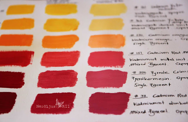
I had meant to do this for some time: colour charts., examples of paint into my sketchbook for reference It's good to know what's in your paintbox, and how the colours actually look on paper, (often quite different than in the tube), and how they mix and match which each other.

So finally, I took out all the paint tubes...


... and started painting small squares of colour examples and mixing them to get an overwiev of what's in my paintbox, adding some information about pigments, opacity, and of course their names. I find paints and pigments a most fascinating subject.


Pigments were traditionally made by grounding natural substances, such as plants, stones, minerals, insects and animals and, according to some myths(?) even cow piss (Indian Yellow). Modern pigments are mostly manufactured synthethically. The Colour Index International (CII) is a standard for identifying pigments used in manufacturing colours.


Hue Pigments: Some single pigment colours, such as Cadmium Red for example, are also available in a "hue" version, such as Cadmium Red Hue. These hue colours are mixed pigment substitutions of the original colour. Maybe the original colour is very expensive, or that it's lightfastness is not so good, and a substitute can therefore be useful. (See here and here for some more information).

Lake pigments: Pigments are usually made by grounding a substance which can then be mixed with a binder to make paint. But some substances can't be turned into pigments, they can only produce dyes. In order to produce pigments from dyes, the dye has to be fixed on to a carrier before it can be mixed with a binder to turn it into paint. These pigments made of dyes are called lake pigments. A well-known lake pigment is Rose Madder Lake, made of the madder plant. It's synthetic form is known as Alizarin Crimson. Paint names can often be very confusing, as they often have a whole range of different names. It also seems that for watercolours, the older, more traditional names are preferred (such as Rose Madder or Chinese White for example), while in acrylics, it's all the new and often fancy-sounding name (Alizarin Crimson, Zinc White).


I was somewhat surprised to find out that Raw Umber, Burnt Umber, Raw Sienna and Burnt Sienna are all made of the same pigment (PBr 7, Brown Iron Oxide). That the two Umbers and the two Siennas are made from the same makes of course perfect sense. But the Umbers and the Siennas look quite different, so I assumed it would be different pigments. But there you go. It's not just the pigment itself that makes the colour, it's the whole chemistry behind them too. And I've never been particularly good at chemistry, I'm afraid...


My palette was getting more and more colourful during my colour sample progress. I should definitely clean it one of these days. But I think it looks rather cheerful at the moment.


I really do find colour, pigments, the making of paints, an extremely fascinating topic. I recently read Philip Ball's wonderful book Bright Earth, the most fascinating book on the topic, I think, and one of my absolute favourites. How lucky we are today that we can just walk into a shop and pick and choose from a whole range of colours which conveniently come in tubes and pots of various sizes. No limited palette, no toxic paints, no sheeps' bladders to keep your paints from drying out (I'm forever grateful to the guy who intenved the metal tube in the 19th century!!). 

Now of course you can ask if it is really necessary for an artist to know all about the hsistory and chemistry of paints and pigments. The answer is no, not really. You can happily paint and create magnificent pictures all your life whithout having the least idea about what's in your paint or how they are made. But then it doesn't hurt to know a bit more about our paints, which are, after all, the most important part of every painter's equipment. Personally, I find it very useful to know more about my paints. It helps me understand them better, and to appreciate and value them even more, knowing their history and origins. (It was also very interesting to learn, for examples, that all the big chemical and pharmazeutical companies that are around here in the north of Switzerland and in neighbouring south Germany started as dye manufactures. Producing dye was a big and important business for centuries, and artists' pigments really just their by-product).

At times, I had been frustrated with my paints. It looks lush and deep and opaque in the tube and on my palette, but on canvas or paper, it turns transparent, thin and several shades lighter. Why can't all they all just have the same consistency? The same opaqueness? And just look on paper as they look in the tube? Well, you can get that if you buy cheap paints with next to now pigments in them. But good paints have lots of pigments in them, and pigments are made up of all kinds of materials and sources,  and often in complacated processes, and therefore they behave differently. And knowing about the different properties of different pigments also allows you to use them in different ways, taking advange and making the best of their different qualities. Learning more about all these things hasn't changed what or how I paint, but it has certainly changed my relationship with my paints.

You can listen to Philip Ball talks about The Chemistry of Painting and look up detailed information about all pigments in The Color of Art Pigment Database. It really is fascinating!

Hop over to Palette & Paint to see what everyone has on their palette!

Monday 5 March 2012

Fine feathers & funny birds

It is not only fine feathers that make fine birds
(Aesop)

No, indeed it is not. Scribbler makes pretty fine birds too. Or fun birds, at least :)

If you don't now Scribbler yet, you simply have to try it out. But be warned: it's addictive!

Friday 2 March 2012

A rosy palette of watercolours and a new drawing board

I've been thinking about getting this drawing board for a while, and when the artist materials shop had a 20% sales offer, I couldn't resist. It arrived last week. It's made of MDF, lovely light colour, and a good 50x70cm size.


I had to immediately try it out, of course. So on went a piece of watercolour paper, and out came the water colour paint boxes.


The Sketchbook Challenge's theme for February was "Close up" and this month, I wanted to participate in the challenge (after having had to give the doodles a miss last month). I found a photograph of pretty rose, a close up of the centre of a rose. Perfect for the theme and for the watercolours. A quick sketch of the subject, although not being bothered about copying it one hundred percent. For the rose, I wanted a rosy pink palette - the perfect opportunity to try out those fabulous pink paints I had bought a few weeks ago.


I started with a palette of Permanent rose, Magenta and the rather extravagant and very dramatic Opera rose.


As the rose was slowly developing, some more colours were needed for shading and especially for the deep shadows between the petals. I added some Madder lake deep, Permanent carmine, Quinacridone violet and Indigo (don't you just love Indigo? Such a gorgeous colour) to mix some deeper reds and purples.


I also used some Permanent Chinese white at the end, for some highlights, as I ended up with too many layers of paint, and almost none of the white paper shining through for natural highlights, as usual. I do love the light and transparent look of watercolour, but I always end up with far too much paint  and very little transparency on mine. The Chinese white didn't really work, of course. It looks great when applied, while it was still wet, but it is transparent, so once dry, there wasn't much left of it. So I used a white ink pen at the end, to add some highlights, which didn't really work too well either. Where the Chinese white is too transparent, the ink pen is a bit too opaque here.


It was good to take those watercolours out again. It's been a while. And it was also good to try and do some botanical painting again (something I want to do much more often), even though I'm not overly happy with the result. Still need a lot of practice with those watercolours. But I like my new drawing board :)

Linking this up with the wonderful and inspiring Paint Party Friday and Palette & Paint
Do have a look at the contributing artists there, it's simply fabulous and so rewarding.