
It's the last week of Summer of Colour already, and I think this must be the first challenge I actually finished! I thoroughly enjoyed it, even though I was away almost half of the six weeks and had quite a bit of catching up to do.
Week 1: Citron Green & Turquoise


Week 2: Orange & Hot Pink


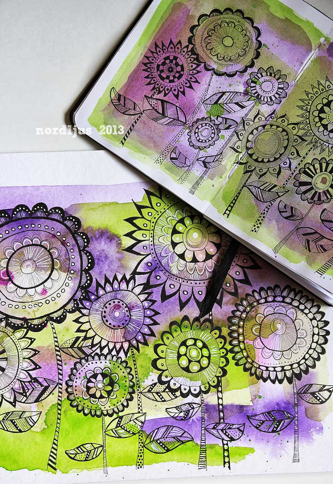
Week 3: Lime Green & Purple

Week 4: Charcoal Grey & Pale Pink


Week 5: Candy Apple Red & Yellow


Week 6: Sage & Sepia


I didn't quite know what to do at the beginning of the challenge, and somehow ended up just splashing the colours on the pages of my little sketchbook and adding some doodle flowers. Because the colours aren't quite so bright in the sketchbook, I decided to do a bigger version on a sheet of watercolour paper. I liked the two versions, and decided to stick with this concept throughout the challenge. I'm glad I did, it's great to see all the six doodle paintings together, and how different they all turned out.

I can't really remember the combinations I voted for each week, but I think that whatever I voted, it never came up. Which in a way was great, because it forced me to try out colour combinations I probably would never have used myself. Especially the Candy Apple Red & Yellow was quite a challenge, as I don't like yellow at all, and although I do like red, not really in the combination with yellow. But I was positively suprised by the result, and I must admit, it turned out to be one of my favourites of the six, together with the lime green and purple one.

I'm planning to keep up these sketches by picking random combinations from magazines or wherever I see them. I probably won't do it very regularly, certainly not one a week, but it's such an excellent excercise, especially when trying out new combinations.
Linking up to Summer of Color - thank you so much Kristin for hosting this wonderful challenge! - and to the fabulous Paint Party Friday, where I can't even remember how many weeks I've now missed, but it's definitely too many.
I actually like your final sepia and sage page best even though they are not my favourite of colours, fatastic to see all your pieces together!
ReplyDeleteI love the sepia and sage piece! I'm going to do one more combination next week because I have one more post card left (I did 4x6 post cards for each one). The combination I'm going to use is sky blue and red/orange.
ReplyDeleteJoin in if you like!
Rind
Great to see them all together! They look wonderful and it's so nice to see what a difference the colours make.
ReplyDeleteYou really ought to see if you can get some of these designs licensed to use as wrapping paper... wallpaper... and other such things. I'm sure you could do really well. They are beautiful :0)
ReplyDeleteI am off my sit now, WOWWWZER!!!. You caught up and most beautifully done!!!. Amazing how simple splashes of gorgeous colors in the background, give dramatic atmosphere for all the detailed doodled flowers overlays!!. I LOVE every single flower for every week :). INSPIRING!!.
ReplyDeleteLoving all your works for SOC and I think your idea of practising color combos is a great. Happy PPF and SOC, Annette x
ReplyDeleteLove all your art for SOC what a brilliant idea! HPPF!
ReplyDeletelove seeing the whole "set"....very nice.
ReplyDeleteA very beautiful collection of colours and doodle drawings. I like the variation in themes!
ReplyDeleteHappy PPF
Ilona xx
I love all your work especially the purple and green as well as the blue...I love how they all look so fab together! Very cool style!
ReplyDeleteHugs Giggles
oh wow- your pages are fantastic!!! I love your doodling and how you've created such a nice collection of pages.Happy PPF!
ReplyDeleteIt was fun seeing all these pages together. I was also impressed that you not only added these to your journal, but also made them stand alone pieces. This is a lovely way to end the SOC challenge.
ReplyDeleteGreat work. They all look great together.:)
ReplyDeletegloria
I like all of these but my fave is the sage and sepia.
ReplyDeleteWonderful
Nicole/Beadwright
I just love them all, especially the last one I think!
ReplyDeleteAll of them are so yummy looking! You did great!
ReplyDeleteI absolutely love your work!!!!! I really like what you created using this week's SOC colors. And I LOVED seeing all of the weeks together here in your wonderful post! Thank you SO MUCH for sharing your talents with all of us at SOC!!!!!
ReplyDeleteYou did a fantastic job on all your entries - love the color washes and the pen work. Really beautiful!
ReplyDeleteFantastic design and colors - a feast for the eyes!
ReplyDeleteI love seeing all your work together like this. This whole series is so cohesive and it just really was wonderful to see. I looked forward to your work every week! I hope to continue following you to see more of your work!
ReplyDeletexo
ReplyDeleteWhat a great idea! These are gorgeous, love the splashes and LOVE seeing them all together! xoxo
These are fabulous. They'd make a great set of postcards :)
ReplyDeleteThese look really good especially when you see them all together like this! Like you, I think the only colour combination I actually voted for was the charcoal grey and pale pink and I would've never chosen the red and yellow together but I think it's been good to try something different even if it's only a colour scheme.
ReplyDeleteA great idea and I LOVE seeing them altogether. Wow. Stunning work. Just stunning. Beautiful use of the watercolour and pen. They are all fantastic. :)
ReplyDelete