Showing posts with label palette. Show all posts

Friday, 4 May 2012

Light & shadows, and the calming effects of earth tones

It was a short week, with Tuesday a holiday and Monday therefore a bridge day, but I'm still glad it's Friday. The past two, three weeks have been a bit emotional (was it something in the air? the stars?), and this week's theme for the Artist's Play Room Challenge "Light & Dark" seemed as fitting as last week's "Rainbow" theme had been. Where there's light, there's shadow, and when everything seems dark, there'll be a light lighting up the shadows somewhere again. There's always both, has to be, as if there was only one of them left, something would definitely be very seriously wrong.


I was quit busy over my prolonged weekend, adding two more pages made of recycled book covers to my Dreams & Wishes Journal for 2012, working some more on the background of my green canvas, but most of all working in my art journal, playing with the light & dark theme. I didn't much think about which colours to choose. Of course there had to be light (Titanium White) and dark (Payne's Grey), but I found myself reaching automatically for the earth tones for my palette.


The Siennas and Umbras (for the portrait I used only Raw and Burnt Umbra) have such a calming, balancing, grounding effect, I think. Close your eyes, and you can just feel the warm Tuscany wind on your face, your feet firmly on the ground, closely connection with the earth, the brown and red and yellow earth between your toes.


I came home late on Wednesday, after my Swedish class, but managed to catch the last 15 minutes of a programme on telly about colour. They talked about the natural pigments, the earth tones of Italy and France, and showed a place in the Provence, in Roussillon, which was dedicated to preserving the old earth colours, most of all the French Ochre (which in Italy is called Sienna or Siena, after the Tuscan city of Siena). The place, the Conservatoire des ocres et de la couleur, also holds workshops about these colours, and how to make them yourself. It all sounded so fascinating, and I'd really love to take such a workshop. It sounds so inspiring! I have to take a closer look at their website, but as I understood so far, the courses are all in French only, and I'm afraid my French is definitely not up to such a specialised course.


But it made me think of exploring these earth colours a bit more, and maybe doing a series of paintings with them, and experimenting a bit. Well, we'll see. I definitely enjoyed painting my earthy portrait.


The more I look at the portrait, the more I like her (despite of all the things and proportions that are wrong). She seems to have that calm and content look on her face I've been lacking for quite some time. And I could swear she winked at me while I wrote this post. "You'll see, things will be all right. Everything will be fine", she seems to be saying. Well, I hope she's right.


I've been a terrible contact this past week. I linked up a post to Paint Party Friday last week, but never really got round to visiting and commenting on the other participants entries. Which is really a shame, as it is such a wonderful, lively and inspiring place. I meant to catch up during the week, but somehow, I had so many things on my mind. It would have been better not link up at all. But I promise to do better this week!


Have a wonderful Friday everyone!

Friday, 13 April 2012

Red phase tea inspired (?) wip

I LOVE my art journal. But the problem with my art journal is that it  tends to keep me away from easel and canvas. But during the Easter weekend, I finally found enough time and energy to tackle the 70x70cm canvas that has been waiting patently in the corner for weeks. I had a hundred ideas in my mind, and none of them included any red. But somehow, I ended up picking up the brighest reds in my paint box. And it felt fabulous and right.


Close-up/detail: I love the texture of the canvas and how building up layer after layer creates more texture.


I must admit that my water jar always fascinates me. How you start with fa jar of fresh clean water, which then slowly adopts all the beautiful colours (and turning into some muddy brown) until being washed down the drain. Isn't this just a beautiful lush red? Like freshly squeezed raspberries.


My palette is now covered in reds. The gorgeous Alizarin Crimson gives a beautiful lighter colour when mixed with white, without turning too pink. I still haven't cleaned my palette, and it is now rather bumpy. Not really ideal for working with a roller.


I added a layer, or rather a few layers, of white on top of it all at the end, because it was all getting a bit too much red. I like the aged, worn look this added.


Still a work in progress, but now I'm not quite sure yet how I want to proceed. I have a few ideas but I'll have to meditate on them and wait what'll come out at the end. I've also very briefly considered just leaving it as it is. But I don't think I have to heart to do so. Not because I don't like it, but because it makes me feel guilty. I always feel that if you want to create a piece of art, it needs a bit more to justify it as such than just slapping on one or two layers of paint on a canvas and scraping it around a bit. And all of that in less than a hour. I think that you have to "slave" at least a little bit over a piece to earn it the name of "artwork". And up till now, it has definitely been to much fun and not enough slaving.

So maybe something with white and light green. This combination just screams spring to me, and all I want to do at the moment is having everything around me in white and light green.

Hmmm, I really wonder where this "red phase" is coming from then. I have a slight feeling though that it might be the influence of a new tea I bought the other day. Pomegranate and Raspberry infusion. Delicious! And the colour is just irresistible. Or maybe it's the strawberry & raspberry sorbet I'm totally addicted to at the moment.


Thursday, 12 April 2012

On my palette: Blooming spring

Now I don't know what the weather was like in your neck of the woods over this past Easter weekend, but here, it was pouring down with rain all Saturday, and snowing all day on Sunday. And I must admit, I  thoroughly enjoyed it. The perfect excuse to stay at home all day, cuddle up on the sofa with a hot cup of tea and a good book, and spending as much time as I wanted in my studio. Heaven. Who needs spring outside, when you have it on your palette!? ;)

I picked up some beautiful Japanese patterned papers I had ordered at the post office  onSaturday morning, and then couldn't resist to head straight into my studio and do something with them. This is half of a double page in my art journal. I only used the paper on this side, and added some tags and stencil flowers, and borders with and without modelling paste. Bright green and pink is such a happy combination I find.


But the page wasn't "spring" enough for me, and I also wanted to create a page to remember the cherry blossoms that are giving me so much joy. I would never have thought about putting a cut off branch of a fruit tree into a vase until I saw those branches in a bucket in the street, but they are simply wonderful!


I wanted to include the tag (which turned out a bit too dark) in the page, but wasn't quite sure how. I didn't want to paste it on like the others on the first page. I thought of attaching the strings somehow, somewhere on the page but at the end, I just wraped the strings around the whole journal's spine, making a knot on the outside.


On my palette: greens, yellows, reds, and blues, and of course white.


Most of all, light green and white. The perfect spring colours.


Linking this to Palette & Paint. Make sure to hop over and visit! Our host Tracey Potter always makes such a wonderful job in presenting our work, and seeing every one's palette is always inspiring.

Friday, 6 April 2012

I brought some spring flowers to the party

This week's just too busy with this and that and other little things. But I didn't want to miss the party today, so I'm using a little watercolour study I did last week and never managed to download from my camera until today.


I always love putting flowers on my dining room table, but it looks even prettier in spring. And they make a good subject for sketching too.


Somehow, I always seem to end up with pinks lately, whenever I take out my watercolours.


But as the work progresses, some green and yellow were added to the palette.


And here's the finished picture. The real flowers are gone by now, but these will continue to be in bloom.


And be sure to pop around Palette & Paint too to see what's on everyone's palette.
And a happy, relaxing, creative and chocolate-filled Easter Weekend!

Wednesday, 28 March 2012

On my palette: Winter blues

I know, it's spring all around here, at least on this side of the globe, and many of you don't want to be reminded of winter right now. But Blue is this month's colour for the Colour Challenge, and blue for me is the colour of winter. The bluish tones of snow and ice, deep blue skies contrasting the snow white landscape, and that special, magical time of transition, when day turns to night, and everything is bathed in blue - the Blue Hour. It is my favourite time of the day, which is so special because it's so short, and so easily missed if you don't pay attention. It's most beautiful and intense up in the mountains.Which really is the best place to be in winter anyway.

I love winter, and blue makes me happy. So here's my blue winter page for March:


Blue is one of the three primary colours, it's complementary colour is orange. It's geometric form is the circle. It ranges from 500 to 450nm on the spectrum. Blue is quite a mysterious colour. There are many languages wich don't have a separate word for blue, but only one word for both blue and green, or blue and dark. In ancient Greece and Egypt, there was no word for blue at all. Blue pigments belonged among the most expensive, and there were many wars fought in the 17th and 18th century because of blue. Among the most prized and exclusive blues were Indigo and Ultramarin. Ultramarin, made from Lapislazuli from mines in Afghanistan, was one of the most expensive pigments, and only the most famous and succesful painters were able to find patrons who would be willing to finance it.


I've been wanting to use one of these snow flakes for ages. It comes from a table decoration chain, which I've cut apart. I also did some hand stitching on it.


The connotations of blue are: romance, sky, water, fidelity, infinity, truth, clarity, wisdom, longing, reliability, consistence, peace, contemplation, purity, justice, other-worldliness and cool distance. It is the colour of intuition, yearning, dejection, intangible mystery, intensive passion. It is the colour of the sky, both day and night, of goddesses, mermaids. Blue has a calmig, relaxing effect and is the classic colour for meditation.


The blues I used for my colour page are: Indanthrene Blue, Phtalocyanine Blue, Cerulean Blue, Primary Cyan, Light Blue and Light Blue Violet. I used Winsor&Newton, Liquitex and Lascaux acrylic paints.


Some expressions can have quit different meanings in different languages. In English, feeling blue means that one is feeling sad, melancholic, depressed. In German, blue is not really associated with any of these feelings, being blue means being completely drunk. Although the said feelings could follow afterwards...


Linking this up to Palette & Paint as well. Go and have a look what everyone else was up to, and what paints and supplies they used.

Thursday, 8 March 2012

On my palette: pretty much everything, really. Or: the fascinating world of paints & pigments

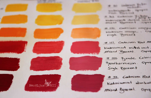
I had meant to do this for some time: colour charts., examples of paint into my sketchbook for reference It's good to know what's in your paintbox, and how the colours actually look on paper, (often quite different than in the tube), and how they mix and match which each other.

So finally, I took out all the paint tubes...


... and started painting small squares of colour examples and mixing them to get an overwiev of what's in my paintbox, adding some information about pigments, opacity, and of course their names. I find paints and pigments a most fascinating subject.


Pigments were traditionally made by grounding natural substances, such as plants, stones, minerals, insects and animals and, according to some myths(?) even cow piss (Indian Yellow). Modern pigments are mostly manufactured synthethically. The Colour Index International (CII) is a standard for identifying pigments used in manufacturing colours.


Hue Pigments: Some single pigment colours, such as Cadmium Red for example, are also available in a "hue" version, such as Cadmium Red Hue. These hue colours are mixed pigment substitutions of the original colour. Maybe the original colour is very expensive, or that it's lightfastness is not so good, and a substitute can therefore be useful. (See here and here for some more information).

Lake pigments: Pigments are usually made by grounding a substance which can then be mixed with a binder to make paint. But some substances can't be turned into pigments, they can only produce dyes. In order to produce pigments from dyes, the dye has to be fixed on to a carrier before it can be mixed with a binder to turn it into paint. These pigments made of dyes are called lake pigments. A well-known lake pigment is Rose Madder Lake, made of the madder plant. It's synthetic form is known as Alizarin Crimson. Paint names can often be very confusing, as they often have a whole range of different names. It also seems that for watercolours, the older, more traditional names are preferred (such as Rose Madder or Chinese White for example), while in acrylics, it's all the new and often fancy-sounding name (Alizarin Crimson, Zinc White).


I was somewhat surprised to find out that Raw Umber, Burnt Umber, Raw Sienna and Burnt Sienna are all made of the same pigment (PBr 7, Brown Iron Oxide). That the two Umbers and the two Siennas are made from the same makes of course perfect sense. But the Umbers and the Siennas look quite different, so I assumed it would be different pigments. But there you go. It's not just the pigment itself that makes the colour, it's the whole chemistry behind them too. And I've never been particularly good at chemistry, I'm afraid...


My palette was getting more and more colourful during my colour sample progress. I should definitely clean it one of these days. But I think it looks rather cheerful at the moment.


I really do find colour, pigments, the making of paints, an extremely fascinating topic. I recently read Philip Ball's wonderful book Bright Earth, the most fascinating book on the topic, I think, and one of my absolute favourites. How lucky we are today that we can just walk into a shop and pick and choose from a whole range of colours which conveniently come in tubes and pots of various sizes. No limited palette, no toxic paints, no sheeps' bladders to keep your paints from drying out (I'm forever grateful to the guy who intenved the metal tube in the 19th century!!). 

Now of course you can ask if it is really necessary for an artist to know all about the hsistory and chemistry of paints and pigments. The answer is no, not really. You can happily paint and create magnificent pictures all your life whithout having the least idea about what's in your paint or how they are made. But then it doesn't hurt to know a bit more about our paints, which are, after all, the most important part of every painter's equipment. Personally, I find it very useful to know more about my paints. It helps me understand them better, and to appreciate and value them even more, knowing their history and origins. (It was also very interesting to learn, for examples, that all the big chemical and pharmazeutical companies that are around here in the north of Switzerland and in neighbouring south Germany started as dye manufactures. Producing dye was a big and important business for centuries, and artists' pigments really just their by-product).

At times, I had been frustrated with my paints. It looks lush and deep and opaque in the tube and on my palette, but on canvas or paper, it turns transparent, thin and several shades lighter. Why can't all they all just have the same consistency? The same opaqueness? And just look on paper as they look in the tube? Well, you can get that if you buy cheap paints with next to now pigments in them. But good paints have lots of pigments in them, and pigments are made up of all kinds of materials and sources,  and often in complacated processes, and therefore they behave differently. And knowing about the different properties of different pigments also allows you to use them in different ways, taking advange and making the best of their different qualities. Learning more about all these things hasn't changed what or how I paint, but it has certainly changed my relationship with my paints.

You can listen to Philip Ball talks about The Chemistry of Painting and look up detailed information about all pigments in The Color of Art Pigment Database. It really is fascinating!

Hop over to Palette & Paint to see what everyone has on their palette!

Friday, 2 March 2012

A rosy palette of watercolours and a new drawing board

I've been thinking about getting this drawing board for a while, and when the artist materials shop had a 20% sales offer, I couldn't resist. It arrived last week. It's made of MDF, lovely light colour, and a good 50x70cm size.


I had to immediately try it out, of course. So on went a piece of watercolour paper, and out came the water colour paint boxes.


The Sketchbook Challenge's theme for February was "Close up" and this month, I wanted to participate in the challenge (after having had to give the doodles a miss last month). I found a photograph of pretty rose, a close up of the centre of a rose. Perfect for the theme and for the watercolours. A quick sketch of the subject, although not being bothered about copying it one hundred percent. For the rose, I wanted a rosy pink palette - the perfect opportunity to try out those fabulous pink paints I had bought a few weeks ago.


I started with a palette of Permanent rose, Magenta and the rather extravagant and very dramatic Opera rose.


As the rose was slowly developing, some more colours were needed for shading and especially for the deep shadows between the petals. I added some Madder lake deep, Permanent carmine, Quinacridone violet and Indigo (don't you just love Indigo? Such a gorgeous colour) to mix some deeper reds and purples.


I also used some Permanent Chinese white at the end, for some highlights, as I ended up with too many layers of paint, and almost none of the white paper shining through for natural highlights, as usual. I do love the light and transparent look of watercolour, but I always end up with far too much paint  and very little transparency on mine. The Chinese white didn't really work, of course. It looks great when applied, while it was still wet, but it is transparent, so once dry, there wasn't much left of it. So I used a white ink pen at the end, to add some highlights, which didn't really work too well either. Where the Chinese white is too transparent, the ink pen is a bit too opaque here.


It was good to take those watercolours out again. It's been a while. And it was also good to try and do some botanical painting again (something I want to do much more often), even though I'm not overly happy with the result. Still need a lot of practice with those watercolours. But I like my new drawing board :)

Linking this up with the wonderful and inspiring Paint Party Friday and Palette & Paint
Do have a look at the contributing artists there, it's simply fabulous and so rewarding.

Friday, 24 February 2012

Playing around with image transfer

Still nursing a very persistent cold, but getting better slowly. But I didn't want to miss another Paint Part Friday, so I dragged myself off the sofa and into my studio to experiment a little in my art journal. I really like the technique of image transfer. I've learnt different techniques in different e-courses, and even bought a whole book just about image transfer. But my first attempts weren't really very successful. So today, I decided to give it another tr.

This is the image I chose for the transfer. I took this during a glorious winter morning walk. Well, I admit, it wasn't actually snowing that day. I added that later in Photoshop, but never mind...


I wanted to create an earthy, natural page matching th colours in the image. And what's more earthy and natural than Raw Umber, Raw Sienna, Burtn Sienna.


And in addition some Payne's Grey and of course Titanium White.


For the image transfer, I used gel medium. The first attempt didn't work at all. Although admittedly that was because I applied the gel medium to the wrong side of the image. Always remember: the gel medium goes on the printed side, NOT the backside... I decided to use the image after all and just pasted it on to the page.


The second attempt was much better. It actually worked! Okay, I admit, it does not look that great. But compared with my former attempts, this is actually very good indeed. Choosing similar colours for the painted layer underneath probably also wasn't such a good idea after all.

 At the bottom, I tried some image transfer using book paper. And that really worked very well.


I really like the book paper transfer. Though I'm never really 100 % sure when and if I've managed to remove all of the paper. It's delicate, this image transfer thing. If you rub too much, the whole printed part starts coming off too.


I decided to try and add some words. When transferring words, remember to invert them before printing them out, otherwise you won't be able to read them properly. That's obviously what happens when you transfer book paper, although I think it doesn't really matter much here, as you're not really going to read the text. But with words, it's another matter. It's also a good idea to cut off as much of the paper as possible. Less paper means less rubbing.


Patience isn't really one of my strenghts, but with image transfer, you have to be patient. When transfering on to a painted surface, you'll have to let it dry completely before you can wet it again and start rubbing the paper off. But also when you print out images, or words, you'll have to let the ink dry first before attempting to transfer them.

So I decided to play around with some photos in the meantime. I used an old photo of some English castle, cut it to a square format, and just painted over it with acrylic paint. I have a whole pile of old photos I meant to throw away, but now I'll hang on to them for experimental purposes. This is really fun :)


Of course I needed to extend my palette for this: some beautiful Cerulean Blue to transform that dull grey English sky into a bright blue summer's day.


When I was done with that, the ink was sufficiently dry, and I transfered the words on to the page to finish it off. I didn't manage to get all of the paper off at the end. The ink started to smudge when it got too wet. But I'm not too bothered about it. I think it works well enough. Maybe a laser printer would be better for this?


All in all, I'm quite pleased with this morning's image transfering. Not perfect yet, but I'll keep on experimenting.

My palette is getting a bit messy. Maybe I should give it a good clean. It doesn't bother me to work with it like this, but it doesn't really look so good on the photos, with all these layers...


Happy Paint Party Friday! Do hop over and have a look at all the talented and inspiring artists there!
Everything got into one long post this week, so I'm also linking this up with Palette & Paint. Do go and visit and see what everyone else has on their palette!