Showing posts with label blue. Show all posts

Monday, 16 July 2012

Back home again

Back home again after a great 2 1/2 week's holiday in England, where, with the Queen's jubilee earlier this year, and the Olympic games later this month, virtually everything is blue, red and white.


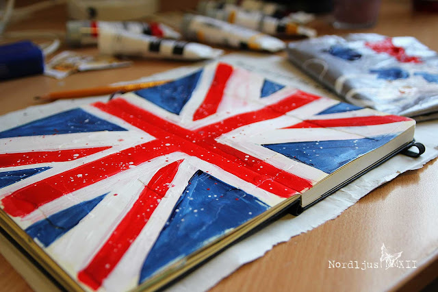
I had taken some water soluble coloured pencils with me to work in my storyboard sketchbook, but I wasn't happy with the pencils, so instead I went to my  favourite art shops in London and bought some paints, stains, inks, stamps... and started a new sketchbook/art journal. Staying in a student hall room without telly for the first 10 days, I happily spent some of my evenings collaging and painting away. With all the Union Jacks, or Union Flags (as it is usually called Union Jack only when at sea, although there seems to be some debate about the whole name business), and with having just purchased some red, white and blue paints, a Union Jack/Flag naturally had to go into my sketchbook.

I had the paints, a couple of brushes, and a water glas, but I hadn't really thought about a palette to mix my colours. A simple plastic carrier bag worked perfect as substitute palette.


I found some Liquitex soft body paints in one (and only that one) of the art shops in London. I really like them, they're perfectly smooth and creamy, but not too soft and runny. I just wish I could have bought more of them, as I haven't seen them anywhere here in Switzerland. But there's a limit to how many tubes of paint you can squeeze into a suitcase.

Thursday, 31 May 2012

A trip to the north

I've spent 10 days in the beautiful city of Hamburg last week. It was my first time up there in the northern part of Germany. Have you ever been there? It's totally worth a visit, and definitely not my last time up there! I spent four of the 10 days there at a conference, but still had enough time to explore the city and even take a couple of day trips outside the city. Of course, being so close to the coast, I just had to see the sea. There was just one question: North or Baltic Sea?


The Baltic Sea was closer and more convenient, so the Baltic Sea it was. I took the train to the little town of Travemünde, and, when I arrived there, was overjoyed to see a whole big sandy beach full of Strandkörbe ("beach baskets"). Those Strandkörbe are typical of North Germany's North and Baltich Sea beaches, and while I had seen a Strandkorb as such before, I had never seen one actually standing on a beach. I don't know how many photos I took of them. They just made me happy :).


Of course I didn't just take photos of Strandkörbe, but I just wanted to quickly share these with you. It's a busy week, my suitcase is still waiting to get unpacked, and I will need a little bit more time until I'm fully back, and present in blog world.


I was glad to see that my blog post scheduling worked perfectly last week, and that my two posts were published as intended. But I must admit that I didn't really think about the fact that it all gets a bit onesided, especially as I didn't have any internet access. So I'll have a bit of catching up to do. I'm really looking forward to visit everyone's blogs. I'll just need a bit of time. But I'm back. And it feels good :)

Thursday, 17 May 2012

SPRING*SUMMER*AUTUMN*WINTER

Sometimes you have a great idea in your head, and you get out your paints, and you start working, preparing all the pieces, only to find out, when you're putting them all together, that it just isn't going to work.

I wanted to contribute something to this month's Art-Journal-Journey Challenge, for May's theme "Zeit / Time". What is time for me? What comes to my mind when I think of time? Time flies, already it is mid May, which means that the spring season's in full bloom. Within a few weeks, the bare trees and brown grass have exploded into the freshest greens, the crops are growing in the fields, gardens are blooming, and the meadows look like green and white carpets. Very soon the summer sun will bleach out all colours, make the pale blue sky flicker, and send people flocking to the lake and river to find relief from the heat and humidity. Slowly, the days will begin to get shorter, the air will get cooler and drier, and the trees around will start to look as if they're on fire, glowing in the brightest reds and oranges, and the leaves rustle under your feet when you walk through the forest in the early morning mist. Soon, it will be cold even in the middle of the day, the air getting chillier and clearer, and beautiful delicate snow crystals start to cover the earth with a soft fluffy cover, turning the world into a perfect winter wonderland. I'm glad I live in a climate where the four seasons are very distinct (although I could do with a bit more snow in winter and less heat in summer). I had an idea about what I wanted to do and made a quick sketch for later, when I would have time to get to work.


I had been working all Saturday afternoon on a watercolour painting (more about it tomorrow), and I wanted to use the same technique for my seasons to reproduce the colours of the seaons.


Summer I found the hardest to do, probably because it is my least favourite season. Even though my idea of a perfect summer holiday does not include lying on a beach, baking in the hot sun and bathing in the sea, I usually spend them in countries where the sea plays an important part - Britain and Sweden.


It's probably not a coincidence that autumn, and especially winter, are the ones I like best. The warm oranges and cool greys and blues just work so well next to each other. I also like spring, though, green being one of my favourite colours after all. But winter is definitely my favourite :)


A palette full of colours of the seasons - spring greens, summer holiday yellows and blues, autumn's oranges and reds, and cool blues and greys of winter.
 

My idea was to create backgrounds and then stick the cut out watercolour seasons on to them. I used the same to colour palettes, and added some text. But when I was finished with them, I realised that it wouldn't really work the way I had imaged.


Even though I had tried to keep the art journal backgrounds as simple as possible, there were too many different things going on in them and the watercolours, that combining them would just be too much. So I'm leaving them as they are, as two different versions of the same theme.


As with the watercolours, it's again autumn, and especially winter, that I like best. I'm going to add some more text, I think, writing down some things about the seasons, and what I like about them.


By the way, have you ever noticed that all four seasons in English consist of six letters? That was definitely a very convenient fact for fitting the words on my art journal pages :).
Linking up to the fabulous Art Journal Journey and the wonderfully 
inspiring Palette & Paint.

Wednesday, 28 March 2012

On my palette: Winter blues

I know, it's spring all around here, at least on this side of the globe, and many of you don't want to be reminded of winter right now. But Blue is this month's colour for the Colour Challenge, and blue for me is the colour of winter. The bluish tones of snow and ice, deep blue skies contrasting the snow white landscape, and that special, magical time of transition, when day turns to night, and everything is bathed in blue - the Blue Hour. It is my favourite time of the day, which is so special because it's so short, and so easily missed if you don't pay attention. It's most beautiful and intense up in the mountains.Which really is the best place to be in winter anyway.

I love winter, and blue makes me happy. So here's my blue winter page for March:


Blue is one of the three primary colours, it's complementary colour is orange. It's geometric form is the circle. It ranges from 500 to 450nm on the spectrum. Blue is quite a mysterious colour. There are many languages wich don't have a separate word for blue, but only one word for both blue and green, or blue and dark. In ancient Greece and Egypt, there was no word for blue at all. Blue pigments belonged among the most expensive, and there were many wars fought in the 17th and 18th century because of blue. Among the most prized and exclusive blues were Indigo and Ultramarin. Ultramarin, made from Lapislazuli from mines in Afghanistan, was one of the most expensive pigments, and only the most famous and succesful painters were able to find patrons who would be willing to finance it.


I've been wanting to use one of these snow flakes for ages. It comes from a table decoration chain, which I've cut apart. I also did some hand stitching on it.


The connotations of blue are: romance, sky, water, fidelity, infinity, truth, clarity, wisdom, longing, reliability, consistence, peace, contemplation, purity, justice, other-worldliness and cool distance. It is the colour of intuition, yearning, dejection, intangible mystery, intensive passion. It is the colour of the sky, both day and night, of goddesses, mermaids. Blue has a calmig, relaxing effect and is the classic colour for meditation.


The blues I used for my colour page are: Indanthrene Blue, Phtalocyanine Blue, Cerulean Blue, Primary Cyan, Light Blue and Light Blue Violet. I used Winsor&Newton, Liquitex and Lascaux acrylic paints.


Some expressions can have quit different meanings in different languages. In English, feeling blue means that one is feeling sad, melancholic, depressed. In German, blue is not really associated with any of these feelings, being blue means being completely drunk. Although the said feelings could follow afterwards...


Linking this up to Palette & Paint as well. Go and have a look what everyone else was up to, and what paints and supplies they used.

Saturday, 16 July 2011

Inspired by...

in·spi·ra·tion /ˌɪnspəˈreɪʃ(ə)n/: someone or something that gives you new ideas and the enthusiasm to create something with them

I discovered Donna Downey's blog "simply me" this week, and her Inspiration Wednesday series. I absolutely loved the page created on the latest post from July 13th, the greys, blues and blacks, the splattering effect, the white areas, and of course the stamping. It inspired me so much that I just wanted to get home, get out my colours and start painting.


Inspiration, though, isn't about minutely following instructions and creating a copy, it's about taking the elements that you like and inspire you and turn into something of your own. It might end up looking completely different, or quite similar but with a touch of your own creativity, as the one I did here.


To apply the colours, I used a palette knive instead of a brush, and I went for some bright red acrylic ink splashes rather than the yellow ochre paint. Instead of printing out some text to stick in (I had something about inspiration in mind) I decided to use one of my new rubber stamps instead, together with a bright red ink. "Listen to your heart" just seemed so right for this.


And even before I started working on these two pages in my art journal, I knew that I wanted to use another of my newly aquired gorgeous rubber stamps.


I just really love that stamp. It's so full of life, joy and energy.

I didn't do any sewing either, as I don't have a sewing machine. But I used a fern branch from the park outside the library to add an element of nature.


I'm really pleased with the result. I love the colours and the technique, and the variety of elements and techniques used. You can clearly see where the inspiration came from, but I think I managed to make into something of my own, and I thoroughly enjoyed doing it.

Sunday, 19 December 2010

Road To Nowhere


There are a one or two things in my life which make me feel like not getting anywhere at all. And although I've been continually trying to change them, I haven't succeeded to make it happen yet. What I want for Christmas therefore is: Change. I hope that next year, I will finally reach a fork on my road to nowhere, which will allow me to leave it and follow a different, more successful path.