Showing posts with label summer of colour. Show all posts

Tuesday, 14 July 2015

Summer of Colour, Week 6 - Crunchy carrots

Yesterday was not only when the last colour combination for Summer of Colour was announced, it was also the last day of our holiday. And what a day it has been (sorry, this is going to be a longer post). N's flight was at 4pm, so we headed to the airport after lunch, had an iced tea in one of the cafés before it was time to say goodbye. I waved him off, heavyhearted, then took the next train back home, checking the airport app and seeing that his plane had left on time on the way. 
I felt very sad and lonely returning to the empty flat, and thought I'd keep myself busy with drawing and painting until I heard from him from London. I was just going to check the arrivals at the London City Airport website to see what time the plane was scheduled to arrive. But instead of a time, it said "diverted, contact airline". What did that mean?? Diverted? Where to?? I dialled the number of the airline and waited almost 20 in the queue until I finally got through. The woman I spoke to didn't seem to understand my question at first, until, while we where speaking, she received the update on the flight - there was a technical problem with the plane, and it had to return to Zurich, expected back at 4.50pm (it was already 5.15). I jumped up and got ready to leave for the airport, but then decided to stay at home for the moment, as here, I could look up the flight on a plane tracker site and stay updated. I saw that the plane had been circling around over the Zürich since it left and seemed to have settled into a steady loop south of Lake Constance. 
It is a scary experience, knowing that your boyfriend is somewhere high up in the air in a plane with a technical problem, but being able to see the plane on the website, and seeing that it was flying at a constant height and speed was somewhat reassuring. I kept checking the site, and shortly before 6 saw it leave the loop and head towards the airport. I was very glad when I saw both altitude and speed at 0, and relieved to receive a text from N shortly afterwards, saying that all was well. The flaps on the wings that help the plane slow down while landing had broken, and it was our guess that they decided to return to Zürich because London City Airport is a very small airport in the middle of the city, with only short (too short in this case) runways. They had to circle for two hours to burn off fuel to make the plane lighter, as it had to rely only on the brakes on the wheels for landing.
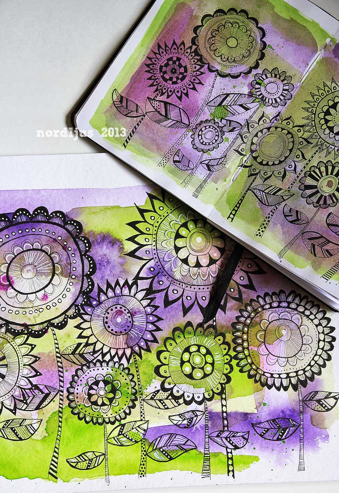
It would still take some time for them to be wheeled back to the gate and sort out the new flights, so I decided to pass the time with drawing and painting this week's challenge. It wasn't until after 8.30pm when N was finally back - without his suitcase, which they had kept to transfer to the new flight. At least we got a few extra hours together out of all this. As he lives on the south coast, in Dorset, a flight on the same day would have been too late for him to get home. So we left again for the airport this morning, said our goodbyes again, and I left for work, which at least will keep me busy during the day. But it will feel very sad and lonely again at home tonight. We did have an absolutely wonderful holiday though, although a bit too hot at times.


I love drawing and painting carrots. They are, somehow, very satisfying to do, both shape and colour wise. And I love the combination of orange and blue.

I very much enjoyed Summer of Colour this year, and I'm glad to have managed to finish it. Having a theme has certainly helped. A big thank you to Kristin for hosting the challenge, and for everyone who took part and made this such a great, warm and supportive community.


I'm happy to say that I just received a text from N, that he's landed. In London. Now I just hope his suitcase will be there too, and that the rest of his journey will be smooth too.

Tuesday, 7 July 2015

Summer of Colour, Week 5 - Succulent grapes

We're back from our little trip to the Palatinate region in Southwestern Germany, and the subject I chose for this week's colours for Summer of Colour - two greens and one pink - is really suitable. A big part of the Palatinate is wine-growing region, the second largest in the country, and we were driving along parts of the German Wine Route, through vineyards and small picturesque villages, where almost every house is a winery. It was a lovely four days, and even though we picked the hottest days for our trip, and the heat really felt almost unbearable at times, we all enjoyed it immensely. I will try and post some pictures later this week, although I didn't take quite as much as I usually would have done. It was just too hot.


Wednesday, 1 July 2015

Summer of Colour, Week 4 - Refreshing water melon

I was lying in bed on Monday morning, wondering what the colours would be for this week's Summer of Colour, and hoping that it would include some red. I had seen those delicious and refreshing looking slices of watermelons in the supermarket, and with the temperatures slowly but steadily rising, I wanted to buy some, and of course draw them too. 

And once again, the colours for this week were perfect. Two reds and one metallic. Well, the metallic sounded very challenging, when I first read it. In my head, I saw silver and gold and bronze - the colours of metals. How was I going to incorporate that into a watermelon? But then I remembered those gel pens I had dug out, to use for drawing mandalas and doodles in my sketchbook. The coloured ones all have a metallic sheen to them, and I had a green one. Perfect. The metallic doesn't really come out in the picture, so I'm afraid you have to take my word for it. If you use those gel pens too, you know what I'm talking about. It was certainly fun to add a different medium to my watercolour background and coloured pencil drawing.


Tomorrow we're off on our little trip to the south of Germany. I was hoping that we would have some fine weather and not get soaked. Well, it looks like it's definitely not going to be cool and wet. But it really doesn't need to be 40 degrees... It'll be a lot of watermelon slices and ice lollies!


Tuesday, 23 June 2015

Summer of Colour, Week 3 - Delicious cherries

Every Monday morning during Summer of Colour, I can't wait for the new colour palette for the week to be announced, and as last week, I was very pleased when I saw the choice of this week's colours. I bought a box of delicious cherries last Saturday, and I left a few, hoping that I could use them as a subject to draw for this week. This week's colours are two purples and a yellow. Perfect. 


Yellow, I have to say, is my least favourite colour of all. Especially those cold lemony yellows. Awful. You hardly find any yellow in my home, and although I love flowers, I don't like yellow ones either (no, not even sunflowers). I've been trying to persuade my Mum to go for a white/blue/pink/purple, and maybe some red and the odd orange, if it absolutely has to be, colour scheme in her garden, but without success. There's always some yellow somewhere, unfortunately. But then, yellow is my Mum's favourite colour, so I can't blame her. (But if I'll ever have a garden, there won't be any yellow in it at all).

I'm alright with those very warm, leaning slightly towards orange kind of yellows, though, such as gamboge, which I used as a background. And I came across a mustardy shade of yellow in a clothes shop in Dorchester earlier this year, which I find myself liking very much indeed, especially in combination with petrol green and/or white.

Drawing with coloured pencils on a watercolour background is very different to just drawing directly on the white paper. The effect of the pencil layers, both colour and strokes, varies quite a lot depending on the layer of watercolour underneath. I enjoyed drawing the cherries, and I very much enjoyed eating them afterwards.

Tuesday, 16 June 2015

Summer of Colour, Week 2 - Juicy apricots

The colour combination for week two of Summer of Colour is an especially juicy one - two pinks and an orange. I was hoping for some red and/or orange for this week, as I bought some lovely apricots on Saturday and wanted to paint or draw them. The colour combination was also perfect for getting that box with those "other" colours out. That's the box with all those colour that didn't fit into one of my regular paint boxes. As I don't use them very often, I decided to make a colour chart first, before deciding which pinks to use. There are some very nice colours in there, I have to say. I think I have to get that box out more often.


I decided to use Rose Madder and Quinaqridone Magenta for my watercolour background, and then added the apricots with coloured pencils. I had to cheat a little bit, as it would have been almost impossible get all the depths in their skin with just one orange. So I used two, although actually, they are just two different shades of Cadmium orange, so they are basically the same colour. Moreover, the apricots themselves have lovely deep red cheeks, so I did hold myself back there.


Friday, 12 June 2015

Summer of Colour, and intuitive painting

Summer has arrived, and with it Summer of Colour, the six week blog party with weekly colour prompts, hosted by Kristin from Twinkle, Twinkle. I finished the challenge in 2013, but only got to week two last year (you can see all the paintings I did for SOC here). It really is a great fun challenge, and this year, I want to finish it again. So I sat down to paint already on Monday afternoon. But I think I got a bit too excited, and ended up mixing up the colours for this week. Instead of using two blues and one green, I used two greens, and one blue.
  

 So I went back to my desk and my sketchbook, and did a quick second one, this time with the right colour combination. I used my trusted "What's in your fridge" theme as inspiration, using watercolours for the background and coloured pencils for the subjects. Two years ago, choosing a theme for my paintings for the challenge (watercolour background with pen doodles on top) worked well, so I might do that again this year, working myself through the contents of the fridge.
 

June is going to be a busy month, creatively, as apart from Summer of Colour, I'm also going to dive into intuitive painting. Three years ago, in June 2012, I took Flora Bowley's online class Bloom True, to get some new ideas, and to generally get my painting mojo back. But I never really got into it and to the end of the course somehow. Maybe I just simply wasn't ready for it back then. But this different approach to painting continued to fascinate me, and I had been thinking about giving it another try one day.

Tuning in to your intuition, letting go, being brave - these are all things that appeal to me very much right now, both on and off canvas. Most of all, I want to put Fun back into my painting process. And my life. I somehow seem to have lost it along the way a long time ago.

When an e-mail announcing a new class beginning in June arrived a couple of weeks ago, I decided to sign up. I'm really fed up with standing in my own way by over-planning, over-thinking, over-expecting... and although it will be challenging, I'm now ready to try and let go. And to just splash some paint on canvas and let it develop. I'm quite excited about seeing where this journey will go.


These are the two canvases I'm working on. I've applied the first two layers, and it's all looking a bit chaotic and ugly. Even more so because both canvases already had layers of paints on them and I just went over them with some gesso. Especially in the first (upper) piece, it made the first layer of reds and yellows rather dull. This is actually one of the canvases I used for the class three years ago. The other (lower) one was a painting I did in 2001. At that time, I was very fond of using lots of modelling past and gold. It was high time to let it go and put it to better use. I've always been a firm believer of painting over any paintings you're not really happy with. And these layers will soon be covered too. So it's alright if they look a bit chaotic and ugly.


and


Sunday, 22 June 2014

Summer of Colour. Week 2: Coral, Teal and Bright White

It's week two of Summer of Colour, and this week's colours are:

Coral & Teal 
with a Smudge, Splash or Pop of Bright White

Again, like last week, it took me all week to come up with something, but this afternoon, I finally sat down, took my toy elephant model out of the bookcase, grabbed my watercolours, and started sketching. I really love the combination of red and teal, I was a bit sceptical, I must admit, I'm not much of a red person, but the really do look great together. The page's not quite finished yet, I want to add some writing, but it'll have to wait a bit.


Next week's colours will be up tomorrow. Can't wait!

Sunday, 15 June 2014

Summer of Colour, Week 1: Aqua, Yellow and Hot Pink

We're in the first week of Summer of Colour, and this week's colours are:

Aqua Blue & Yellow
With a Smudge, Splash or Pop of Hot Pink

Such a cheerful, happy and summerly combination of colours, and I was really looking forward to playing with these. But, I've been wrecking my brain all week, and just couldn't come up with anything. Today, the last day of the first week, I've finally managed to get something on paper. The three pears in my fruitbowl, with their different shades of yellow, gave me some inspiration at last, and luckily, I've got quite a selection of different yellows in my paintbox to match.


Week two will start tomorrow, with a new combination of colours. Can't wait to see what they are! And hopefully, it won't take me the whole week again to come with something.

Friday, 6 June 2014

Holiday drawings, Bics, and Summer of Colour

I spent a relaxing holiday in lovely Dorset last week, and while my batteries have fully recharged while I was enjoying walking on cliff tops, through forests full of wild rhododendrons, eating fish & chips at the seaside, a great National Trust day out, and many more things, they seem to be already drained again. But anyway.

Of course I took my sketchbook with me, but I ended up not really doing much sketching at all. But I got two done, at least. One sketch I did on the train, using a black Bic pen. It's a bit of a bumpy ride at times, so getting a straight line was even more of a challenge than getting a straight line in itself already is, but it made the two hours from Woking to Dorchester pass quickly.


N. and me are not much of the going out type, we're usually out and about all day, and then are too tired in the evening to do anything else than flop on the sofa and all attempts to go out never came to anything and it was all beginning to become a bit of a joke. So when N. announced that he had arranged a night out for us, and on a Saturday night too, I must admit I was very intrigued, and a little bit worried, especially as he absolutely refused to tell me where we were going. What could he possibly have come up with? After all, the possibilities in Dorchester are somewhat limited. Well, I needen't have worried, because it was a great evening out. N. had got tickets for Mat Ricardo, "gentleman juggler", at the Corn Exchange, part of this year's Art Festival. It was just amazing, an hour full of fun, stories and history, and of course stunning juggling tricks. If you ever have a chance to see him, do! You won't regret it.


Apart from a range of pens and pencils, I also took some coloured penciles with me this time. I haven't used them for ages, but I'm trying to explore them a bit more. Most of all, I'm still looking for the ideal travel sketching set with mediums that are easy to carry, versatile, and fun to use. Last time I sketched on the train to Dorchester, I spent half of the journey watching my watercolour paints dry. And you have to remember to empty your little water spray bottle before boarding the plane, and to refill it again after landing. And although they're very handy, I'm just not a great fan of those plastic water reservoir reservoir brushes, I just prefer proper real brushes. I just bought a fancy little travel watercolour brush in England, though, so I still hope to use watercolours more often for outdoor and travel sketching. But coloured pencils definitely are an option that need some more testing.

And then of course there's the Bic ballpoint pens. I really don't know why I haven't discovered them earlier, they are absolutely wonderful for sketching. So smooth, and such gorgeous fine lines. And I like the fact that the red one is a nice dark red, and not the bright red I had expected (feared) to be. And then I found those beautiful "fashion colours" at a shop in England, perfect for summer. They're slightly thicker (1.6) than the normal ones (1.0), but still make nice lines. Bics are definitely going to be a part of my sketching basics.


Back home from the much more agreeable temperatures in England, summer is now arriving here, and temperatures are rising, getting close to 30°C today, and over 30°C over the weekend. I'm not a summer person at all, and I'm not looking forward to the heat, and I'll be glad when summer's over and autumn will bring cooler temperatures. But there a couple of things that I'm looking forward to this summer, one of them being Summer of Color 4: Smudge, Splash & Pop, hosted by Kristin. I participated for the first time last year, and it's one of the few challenges that I actually completed. And thoroughly enjoyed. It was a great experience to use colours and colour combinations that I wouldn't have used, and really liked how my paintings turned out. You can see my posts from last year here,  and read more about this year's Summer of Color and how to participate here. The first colour prompt will be up on Monday, 9th of June. Don't miss the fun!

And lastly, I'm going to link up with Paint Party Friday, even though technically speaking, I haven't done any painting at all. But it's been ages since I joined the party, and I can't wait to see what everyone's been up to.

Friday, 19 July 2013

Summer of Colour - Finished!

It's the last week of Summer of Colour already, and I think this must be the first challenge I actually finished! I thoroughly enjoyed it, even though I was away almost half of the six weeks and had quite a bit of catching up to do. 

Week 1: Citron Green & Turquoise


Week 2: Orange & Hot Pink


Week 3: Lime Green & Purple


Week 4: Charcoal Grey & Pale Pink


Week 5: Candy Apple Red & Yellow


Week 6: Sage & Sepia


I didn't quite know what to do at the beginning of the challenge, and somehow ended up just splashing the colours on the pages of my little sketchbook and adding some doodle flowers. Because the colours aren't quite so bright in the sketchbook, I decided to do a bigger version on a sheet of watercolour paper. I liked the two versions, and decided to stick with this concept throughout the challenge. I'm glad I did, it's great to see all the six doodle paintings together, and how different they all turned out.


I can't really remember the combinations I voted for each week, but I think that whatever I voted, it never came up. Which in a way was great, because it forced me to try out colour combinations I probably would never have used myself. Especially the Candy Apple Red & Yellow was quite a challenge, as I don't like yellow at all, and although I do like red, not really in the combination with yellow. But I was positively suprised by the result, and I must admit, it turned out to be one of my favourites of the six, together with the lime green and purple one.


I'm planning to keep up these sketches by picking random combinations from magazines or wherever I see them. I probably won't do it very regularly, certainly not one a week, but it's such an excellent excercise, especially when trying out new combinations.

Linking up to Summer of Color - thank you so much Kristin for hosting this wonderful challenge! - and to the fabulous Paint Party Friday, where I can't even remember how many weeks I've now missed, but it's definitely too many.

Saturday, 13 July 2013

Summer of Colour, Week 5

I wasn't too happy about this week's colour combination, Candy Apple Red & Yellow, I must admit. I like red, but yellow really is my least favourite colour, and I just wasn't convinced that the combination of the two could produce something I'd be happy with. But of course I decided to give it a go, and as the yellow wasn't a specific yellow, I decided to make the best of that and use as warm a shade of yellow as possible, bordering on light orange.


I've only come as far as finishing the sketchbook page, and preparing the background on the sheet of watercolour paper. But I'm determined to finish that one too over the weekend, and catch up with the the past two weeks too, to be ready for the final week next week.


I did the doodles only last night, and, with my head being full of all the new stuff that starting a new job brings with it, my imagination was a bit limited. So I decided to go back to one of my older designs from my trainsketches. I love these sketchbooks, they are becoming such a great source for inspiration.


I have to say that I'm quite pleased with the result. The colours work well together, and I'm glad I tried a combination I'd never would have chosen myself. Can't wait til Monday now, when the last combination will be announced (can't believe it's already the last week!). I already can't remember what combination I voted for, but I'm hoping that it's going to be one that includes blue. We haven't really had any proper blue so far, only the turquoise in week one. Anyway, still lots to catch up with, so I'd better start working.

Sunday, 7 July 2013

Summer of Colour catch up

Back from my wonderful two and a half week's holiday in England, and I've got a bit of catching up to do. In the first week of Summer of Colour, I did a sketch in my sketchbook first, and then a second one on a sheet of watercolour paper. I enjoyed the different effects of the different papers and watercolours, but it also meant that I felt that I had to keep this up for the following weeks. Which is rather time consuming. I did take some watercolours and sketchbooks with me on holiday, and although I haven't been very productive, I did a page or two, and back home again, I spent today with preparing the backgrounds of this and last week's colour combination and with adding the doodle flowers on the background sheet for week two.

Week 2: Orange & Hot Pink


Week 3: Lime Green & Purple


Week 4: Charcoal Grey & Pale Pink
I found a sketchbook with a landscape doodle I did one and a half years ago, and thought it would make a nice change from the flower doodles. The flowers doodles from week two came from the same sketchbook. I didn't even know I had done these! I'm afraid the pale pink didn't turn out too pale though.


I can't wait to learn which next week's colours will be. So far, none of the combinations I've voted for has come up in the respective week, but I've thoroughly enjoyed each and every one of them. But then that's the fun of these challenges, to do something you wouldn't normaly do yourself, isn't it.

Friday, 14 June 2013

A citron green & turquoise flower garden

It's the first week of Summer of Colour, and the colour combination that got the most votes was citron green & turquoise. And as usual, with challenges, my mind immediately went totally blank when I started thinking about what to paint with these colours. I saw postings popping up everywhere, in the Facebook group, on blogs, thinking, 'ah yes, that's a good idea', and 'this techniques works well'. Blank. Then I saw Tracey's gorgeous bag (I want one!!), and thought, well that's an idea. Look around the flat for something in those colours, and just draw it. Blank.


So at the end, I decided to keep it simple. I did this flower doodle page in my little sketchbook on the train to and from work, and decided, to just paint the flowers turquoise and the background green. 


I quite liked it, so I decided to do another one, this time using proper watercolour paper and watercolours. I splashed some green and turquoise on the paper for a background, and then started doodling on top of it. It's not the most ingenious idea, but I'm in a kind of doodling mood this week, and it makes me happy, and that's good enough for me, really.


And of course, when I had finished my two little sketches, I saw all those turquoise and citon green things everywhere around me. That necklace, which I haven't worn for ages, and somehow just felt like wearing again today ( - just look at its shape!). 


My current favourite mug which I bought on my holiday in the south of England last month.


And my new notebook that I got earlier this week, and which is going to be my little "blog book", to help me get more organised with my blog, and better keep up with blogging. And the new matching pens, and the different washi tapes I already had. And my other favourite mug. Isn't it just typical!


Have a wonderful weekend everyone! Can't wait what next week's colour combination will be. I might just keep going on with my water colour splashes and doodling, to save my sanity :)

Wednesday, 5 June 2013

Summer of Colour

Summer is very reluctant to make its appearance this year, and spring, well spring has been more like February all the way through. It's been cold, grey and wet for the past weeks, but this week, it looks like we're finally getting some warmer und brigher weather. And with it, more colour. I've come across Summer of Colour last year, when many of my blogger friends posted beautiful artwork in the brightest (ice cream) colours for several weeks during summer. It looked intriguing, but I had missed the start, and didn't want to jump in somewhere in the middle. But this year, I'm going to join in.

This year, the colours are chosen by the participant in a vote, the winner then being announced the following Monday.So this being the first week, we have to vote for the first colour combination to work with next week. There are twelve different combinations, and they all sound very intriguing. I must admit, I haven't quite made up my mind yet, but the decision will probably be one of two choices.

I'm really looking forward to start working with the first colour combination next Monday. Challenges are a great way to stretch your artistic mind, and do something you normally wouldn't do. Although, to be honest, I also very often find them quite stressfull. My mind just seems to go completely empty, and I can't think of anything at all, until when the given time is over, when my mind just overflows with ideas, and I could complete at least 10 different pieces for the prompt. But I hope that with colour, it might be easier. And hopefully, this will be a challenge that I'll actually complete. Even though I'll be away for 2 1/2 weeks.


And to get into the right colourful mood, here are some pictures I've just come across when going through some old photos on my computer, from my trip to Vienna two years ago.

A cup of coffee in the beautiful café of the Hunderwasser Museum KunstHausWien, where the morning May sun is playing with the coloured glass table tops, turning the whole courtyard into a peaceful fairy tale scene...


The famous Hundertwasserhaus, designed by the Austrian artist Friedensreich Hunderwasser (1928 - 2000)...


The myriad of colours and patterns in the interior of the Stefansdom, painted  by the sun shining through the stained glass window...