Showing posts with label shades of purple. Show all posts

Friday, 25 May 2012

Tea with Mr Berry and his friends Rasp and Black

I've been having some serious troubles with my Messy Book. It's simply amazing with what the others in the Messy Book Group come up with, all these different ways of misstreating their books, and creating a wonderful mess. But I've been struggling. I'm usually messy and choatic enough, and I've no problem in constantly creating a mess in my home. But when it comes to books, and art, and paints, there's my little tendency of perfectionism coming through, that wants to create something lovely, something nice, and that simply doesn't want to rip apart a book, or bury it in the ground, or throwing it out in the rain.


But I'm determined to give it a go, and I've forced myself to do something I wouldn't usually do. So meet Mr. Berry. He lives in an ancient little town, far far away behind the mountains, and he loves to spend hours on end in his comfy chair, with his somewhat undefineable, but very friendly, cuddly pet Black at his feet and his feathery friend Rasp sitting conmfortably on his shoulder.


They drink innumerable cups of fragrant Earl Grey Tea and Mr. Berry makes up stories about fairies, sea monsters and other fabulous creatures, which have a tendency to come to life behind his back, hiding behind the chair, without him ever noticing.


If you suspect that the words in italics have more to do with this creation than just serving as random names for the characters and their preferred beverage, you're absolutely right. I used all the ingredients of my delicious breakfast that day for this page: rubbing the juicy paper bit at the bottom of the raspberry basket on to the page, rubbing in some Ear Grey tea leaves, and squashing a whole blackberry between the pages.


The blackberry was already a bit mouldy, so it was perfectly juicy and it didn't involve wasting a perfectly good blackberry. For which they are far too delicious really :). But aren't the colours just gorgeous? I guess the fact that they're among my favourite colours made it a lot easier to mess up the page :)

Sunday, 13 May 2012

Sweet Mother's Day

I thought I'd bake a cake for my mum for Mother's Day today. Even the ingredients were happy to help me prepare a sweet surprise for my mum :). I didn't actually notice the smiley face until I looked at the photo, so it's upside down, I'm afraid.


Especially sweet decoration. The yellow and green ones would no doubt have suited the lemon cake much better.


But I just liked the pink and lilac ones better :)


No calory counting today! :)


Happy Mother's Day! 
Hope you all have/had a wonderful Sunday!

Thursday, 26 April 2012

Dreaming myself away for a while


I've been feeling a bit low recently, so what better to do than taking out my art journal and dream myself away a little.


One of my favourite colours, a shipping tag, a postcard and some other stamps, and a strip of paper with a copy of the title of The New York Times sent me away to my two favourite places, Sweden and Great Britain.


I'm going to visit both of them this year, so I guess it's a good year. I'm certainly looking forward to both trips, even though they're still quite some time away.


It's been a busy week, but it's Thursday evening at last, and I've got a veeery long 5 day weekend ahead of me to look forward to. And tomorrow I'll be off for a day trip to Germany, including even a little visit to Sweden for a few hours. I'll tell you more about it during the weekend, and hopefully with a few great photos to show :).


Posting this today already but linking it up with Paint Party Friday tomorrow, and looking forward to visiting you all during the weekend!

Tuesday, 28 February 2012

Green & purple, and simply irresistible eyeliner

This months colours for the Colour Challenge were lavender & green. And some texture thrown in for an extra challenge. When I did my journal page, I somehow had "lilac" in mind, rather than "lavender", and only relised it after I had finished it. But then lavender and lilac are a sort of purple, and it's all pretty similar, and anyway, after having done some research into green and purple (which happen to be my two favourite colours), and particularly the colour purple and all it's variations in a blog post almost a year ago, I don't really know anymore which shade is what.

So here's my colour study page about green and purple (or whatever you want to call it) for February. I love bamboo, and painted a lot of them during a green/bamboo phase a few years ago. The pansy really was just the first purple flower that came to my mind which wasn't too challenging to paint. I added some coarse and grainy modelling paste at the bottom of both pages to add some texture, but it doesn't show very well in the photo. I also added some stamps, butterflies and grass, for texture. The colours didn't come out so well in the picture, it looks much fresher on the page really.


Purple is the result of subtractive colour mixing of red and blue, it's complementary colour is yellow. It's geometric form is a combination of circle and square, its ranges from 450-396nm on the psecturm. At around 1500 BC the Phoenicians discovered how to extract purple dye from the purple murex (a kind of snail). Today, there are almost no lightfast purple pigments. Lilac and lavender are more popular than the powerful and rather unpopular purple, especially in older age. Purple is a difficult colour full of opposites and a range of different connotations. In astrology, purple is the colour of aquarius (maybe that's why I find it attractive!?).

Its connotations are: self-determination, (spiritual and secular) power, melancholy, imagination, connection, lust, height, eternity, depth, magic, modesty. Purple can give a feeling of narrowness, of distance, but it's darker shades can also have a calming effect, while lighter shades can be stimulating, and even intrusive. Introvert people favour purple because they can relate to the colour's tension between two opposite poles.

Green sits between yellow and blue, it's complementary colour is red. It's geometric form is a combination of circle and trapezium, it ranges form 550nm (lime green) to 500nm (turquoise) on the spectrum. Most green pigments today are based on chromium, many pigments such as verdigris are highly poisonous, and a whole range of greens are poisonous if the pigments aren't manufactured synthetically. The colour was immensely popular at the end of the 18th century, when many houses and rooms were painted and/or decorated with (poisonous) green. In German, ther are over 40 shades of green ranging between yellow green and blue green.

Its connotiations are: life, nature, harmony, paradise, trust, confidence, hope, vital energy, exuberance, growth, new beginning, jealousy, spring, poison, fertility, new love, balance, immaturity. Green is calming and balancing, harmonious, it strenghtens self confidence and self esteem. It especially appeals to people who are nervous and restless.

Some random (and quite interesting) facts from my little, rather esotheric, colour book:
  • men are attracted to women who wear purple, but also fear that they are liable to hysteria and have a strong tendency for individuality
  • if you have brown eyes, green eyeshadow will make you irresistible

    As it happens, I just bought some green eyeliner for a change two weeks ago. I have only tried it out at home, so far, and thought that it looked rather strange, really. But I'll get it out of the drawer again now, and give it another try. Irresistible. Hmmmm...

Friday, 21 October 2011

Too many ideas, too little time

I just realised it's ten days since my last post. So much about my resolution to write and post regularly on this blog (at least about three times a week is my current goal)! I've spent a short holiday/long weekend in England last weekend, with two trips to London to visit my favourite shops and stocking up on various art supplies and stuff (more about this later ) and to see two excellent plays at the Haymarket (The Tempest - oh I loved Ariel!) and the Wyndham Theatre (Driving Miss Daisy), and three days of spending the day strolling through country houses and their parks and gardens, among them my favourite place, Anglesey Abbey (never get tired of visiting this place!). And then there's work, there's the Blogging Your Way e-course I'm spending quite some time on, filling my notebook like mad, and all the new paints and things to try out. Not to speak of the hundreds of pictures I took in England that are waiting to be sorted through, looked at and post processed.

So I'm posting this post today, which I meant to post last week, before my trip. I spent the weekend two weeks ago with my watercolours - the bad weather was a perfect excuse to stay at home and paint.


I love blueberries, and an old photo I posted on Flickr last year was perfect to copy.


I really love the layering possibilities of watercolours. I know I've mentioned before that it is rather different than painting with acrylics, but I still find it very fascinating. And I'm still loving my squirrel brush. (Btw, Nigel, to answer a question I meant to answer ages ago: the other animal hair famously used for the finest watercolour brushes is that of the Siberian weasel, or kolinsky, known as Kolinsky sable-hair brushes, or simply just as pure Kolinsky. They're made by using hair of the winter fur of male animals).


But it always takes quite some time for them to dry, and it does require patience. Much more than acrylics, where you can just use a hair dryer to speed up the process. But it's not really such a bad thing.


The most difficult part of all, though, is to take pictures (or scans) that reproduce the colours accurately. I really find that quite impossible. Even more so as I do a lot of my painting in the evenings, after work, with no natural light.


Some finishing touches, and they're ready to go into a frame and up on the kitchen wall. Or more likely into the portfolio, together with all the other ones... I really enjoyed doing this, so much that I decided to use it as my blog header for the moment (I'm working on a new one, but it may take some time).

My head is full of ideas right now, for paintings I want to do, sketches to try out, colour charts to put together, art journaling pages to be filled, pictures to process, pictures to take, blog posts to write, and most of all, with ideas for improving and (re-)designing my blog. But I'll have another busy weekend before me - I'll have to work on Sunday :( - so I'll still be needing some time to catch up with everything - both with working on my own blog and with staying in touch with other bloggers. I'm still here, I'm still visiting and enjoying all the wonderful work out there, and I'll be in touch again more actively soon. It's a promise!

Thursday, 25 August 2011

Sunday morning art journaling & a new texture

*** you'll find the texture & download at the end of this post ***

I love spending Sunday mornings in my study/studio. The morning light coming through the window lightens up the room and inspires me to take out my paints and stuff and just do something with them. This morning, I finished another double page for my Inspiration Journal, a little booklet made out of old book covers on which I create paintings to inspire and encourage myself on my creative journey.


I also finished the front cover of the Inspiration Journal the day before. I wanted to keep it simple but also inviting to open the book. I just love this paper with those happy smiling pigs. In German speaking parts, pigs stand for good luck, and some good luck vibes seemed a good idea for my journey, wherever it will take me, and whatever road I will find the courage to follow. I might add some details to the wings, later on, but all in all, I'm quite happy with the result.


My Inspiration Journal isn't actually book yet. It's just a pile of painted book covers at the moment, but it's all coming together nicely, and once I have all the pages finished, I'll punch some holes and voilà, my own little inspiration book.


As I had some paint left, and I don't really like to waste my paint, I decided to use it on a sheet of canvas, and make a simple texture for photo processing out of it.


And here's the result, my little Listen To Your Violet Heart texture. You can use it with or without the text, just as you like. I'm not quite sure how it is, to be honest, but maybe you'll find some use for it, the text (a stamp) didn't quite turn out as I wanted in the scanning process. And I'm still learning what works best as a texture for processing photos with.


Here's the link for the download (or click on the image above), if you'd like to give it a try yourself.

Here are two examples where I used the texture - turning a sunny winter landscape into, well, something a bit, hmm, quite weird, I admit - I was just in the mood to play around and be a little bit silly ;).

I guess you just have to like the colour purple/violet for this :)

Tuesday, 23 August 2011

There. I did it.

I set up a Facebook page. Not a personal account, but a "business" page (not that I have any "business" (yet)). Why I am thinking about setting up some sort of "business" (there, I can't even write it without the inverted commas), is something I will be writing about some time later, this week, or next.

But back to Facebook. I have resisted Facebook so far (which hasn't really been very hard) for 2 3 reasons:

  1. I simply felt, and still feel, very uncomfortable about sending my real name, my own real identity into the WorldWideWeb. I'm shy, you see. That's what I like about all the other things I'm using, my blog, Twitter, Flickr, you don't have to make your real name public if you don't want to.
  2. I find the design of Facebook utterly unattractive. I'm a visual person, I've even been called an aesthete once, and the design of Facebook just doesn't appeal to me. At all.
  3. I'm already spending a lot of time online with writing posts for my own blog, reading and commenting on other blogs, trying to keep up with Flickr, not keeping up with Twitter at all at the moment. Not to mention that I feel that I never have enough time for offline things, such as processing pictures, and most important of all, painting, drawing, sketching, creating...
So why have I now set up a page, after all? Well, it's all got to do with this e-course I've subscribed to (the thing I'll be writing about in another post, soon). There's a private Facebook group for the course, and apparently, there's a lot of discussion going on there in which I can't participate, because I'm not on Facebook.With that "project" I have in mind doing, I probably would have set up this Facebook page anyway, sooner or later, and as I would like to participate, well, I just had to set it up sooner, rather than later. Which I have done now.

And having registered, and set it up, I'm completely confused. I usually have no problems getting the hang of these things. I just try everything out and find my way through all the possibilities. But Facebook really just totally confuses me (maybe there's still that inner resistance). Also, I haven't created my profile yet. Because, as I said, I'm somehow completely reluctant to make my real name public on the web (everything you find by googling my real name is work related). But it seems that in order to connect with others, to really do something with that page, I have to create my profie. I have considered using a pseudonym (and I have come up with an adorable name (at least I think so), so much more 'me' than my real name), but I don't know really how much sense that makes. No one who knew me really would find me, and telling all my friends and family that I have an alias sounds rather impractical (they'd probably just laugh at me...). And also, I don't know if you can later change the name once you've put your profile up with a certain name.

So I haven't really come very far with my new Facebook page yet. I added a profile picture (which somehow I managed to upload twice, and I don't know where to delete it. (Where are the delete buttons/options???), and I've written a status message, or whatever it's called (I find the terminology there rather silly as well). And now I'm sort of stuck. I don't know what next to do (oh, I still so love my alias, and do I really want to write my real name?).

The only thing I really enjoyed was designing a kind of "logo" or button I'm using as my profile picture:


I'm sure I'll be making some alterations to it very soon (as with my blog header, which is a constant work in progress), but for the moment, I like it, a lot :). (And I think I'll have to add (digital) collage to my creative activities...).

And oh, as I mentioned, I didn't create a personal account, but a "business" account, registering as "artist", and feeling completely silly (and rather embarrassed) about it. Probably another reason why I feel so shy about daring to write my real name....

And just in case you're interested, here's the link to my Facebook page. Come and visit, and if you have any tips about how to get along with Facebook, I'd be more than grateful.

Saturday, 14 May 2011

Purple & Green

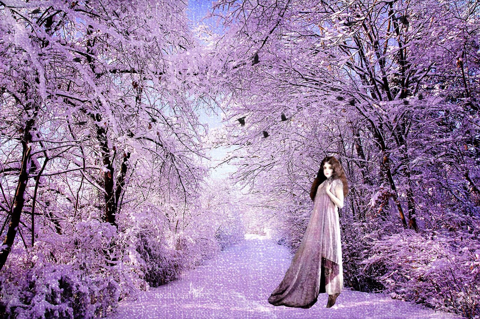
My favourite colour is purple, with it's lighter shades, lilac/lavender. I love the richness and drama of purple, and the lightheartedness and airiness and joy of lilac. Purple is a mixed colour, not a primary colour, made by mixing the two primary colours red (magenta) and blue (cyan).

Last summer, I bought an old sofa from about the 1920/30s in a "Brocki" (secondhand / thrift shop). While the upholstery is in perfect condition (it had been standing in an office and was never really used), the fabric, tough in perfect condition, was simply awful. I found an upholsterer, and ever since, I've been trying to find the right fabric. I had red in mind, matching the reds and oranges in the living room, and a greyish linen fabric with plush stripes in reds and orangs seemed perfect. But somehow, I just couldn't commit to it. About two months ago, I started considering green. I haven't quite decided on a speficic fabric yet, but I know now that green is the right colour. After I came back home from yet another visit to the upholsterer's shop and having looked at green fabric, I walked around the flat and realised that it was full of greens. Green everywhere. Especially in the kitchen. Most of the kitchen supplies that come in colours, I have in green. The thought of green felt good, reassuring, soothing, right. And I realised that purple wasn't my only favourite colour, but that it shared it's place with green. Purple was an conscious choice, green an unconscious. And I simply love the combination of the two. There was one time when I almost decided to go for the red fabric, simply because of not knowing what else do choose. I'm so glad I didn't. I wouldn't have been happy with it. But I know that with green, I'll always be happy, even in ten year's time.

Green: German: Grün. Swedish: grön. French: vert.
From OE grene or groeni, closely related to the OE verb growan "to grow, to turn green". First recored use in English in AD 700. Most common colour in nature, because of chlorophyll.
Associations: life, growth, spring, hope, freshness, naturalness, confidence, health, youth, envy, sickness.

Apparently, many Asian languages don't make a distinction between green and blue, and indeed the distinction between the two doesn't always seem to be so universally clear. I have often noticed that people would refer to a certain colour or shade as "blue", whil to me, it was obviously green.


Violet: German: Violett, from French, after the flower "violette" (Veilchen, violet). Swedish: violett. French: violet.
Colour between blue and red. Next to Purpur/purple on the colour wheel. Lila/lilac is a lighter shade of purple. Colours nearer to blue. In China, the colour violet symbolises the harmony of the universe, as it is right between red (ying) and blue (yang).

Purple: German: Purpur. Swedish: purpur. French: pourpre.
Any colour/range of hues of colour between blue and red. Colours nearer to red. Between magenta and violet on the colour wheel. The colour is associated with royaly and nobility (from classical antiquity).
From OE purpul > from Lat. purpura > Greek porphura, the name of the Tyrian purple dye manufactured in classical antiquity. First recorded use in English in AD 975.
Associated with: emancipation, creativity, spirituality, mystical, mysterious, secret, dignity, desire, longing, aphrodisiac, (as liturgial colour) penitence.


I always thought that the German Violett corresponds to the English purple, but apparently, I've been wrong. Also, what I've believed to be Violett in German, is actually Purpur, and the colour I always referred to as Violett is actually Dunkelviolett. And the Purpur, that is usually used to refer to the capes of monarchs isn't actually Purpur but Red. Very confusing...


And the colours/colour codes I found for violet and purple really do look quite similar - and somehow are missing those shades I usually would refer to as purple. And I even found somewhere that Violett and Lila are synonymous. Which to me really are very different - the former being dark (purple), the latter light (lilac). And then there's of course lavender, which in English is a whole range of shades, but doesn't seem to have a correspondent in German, but really is something similar to lavender, whic is probably why I never really know how to properly translate lila into English. Very, very confusing.


I took some pictures of these clematis in the garden last year, after I just bought my first DSRL, and I was so frustrated that the rich bluish purple always ended up having a red tinge on my display. This week, I went out again to take some pictures of them and I expected to have the same problems with colours. But having learnt a bit more about manual settings and white balance, I was surprised and happy to see, that this time, I got exactly the right colour. This really must be one of my biggest achievements so far in my process of learning DSLR photography :).


For my "green mug & purple nails" shot, however, I didn't pay enough attention of my white balance settings. It didn't turn out as had it in mind at all, and the purple/lilac of the nail varnish didn't turn right at all. This time, the opposite of my last year's clematis shots happened: the red tinge turned into a blueish one. But white balance is something I'm still struggling to master, especially in indoor situations.


Well, I'll keep on working on that. And I'm thinking about making a colour series: one colour a week. I'll definitely start with green :)

Monday, 2 May 2011

Personalise your sketch book

I bought a few books full of wonderful creative ideas, excercices and inspiration. One's a book with drawing exercices, which I love especially. I've been wanting to do more drawing and sketching for a long time, and last year, I bought a great book about learning how to draw properly. I still haven't managed to work through the whole of it, though I made a start, which really convinced me about the method and approach tought in the book. The new book has a more fun approach, and it just made me want to start drawing right away. I have the week off, and will be away for a few days, so it's the perfect time to start reading the book and doing some of the exercices, and start drawing.

Of course, I needed a new sketch book for this. So I went to my favourite art supply shop in town, and bought one. It' a prober sketch book, suitable for different medias, with thick, good quality paper. I love the square format and I wanted one that is not too big, so that it's still convenient enough to carry around.

But of course, those black blank covers want a bit of personalising, and a touch of colour. The great thing with acrylics is that you reallycan paint on anything with them. Use a masking tape so that you won't have to be careful about going over the edges. (There's nothing more obstructive to the flow of creativity than having to be careful all the time about not making a mess).


Apply a coat of white paint or gesso and let dry. Use a hair drier (or heat gun) for speeding up the drying process. If necessary, especially if you want to use light and/or not so well covering colours, apply a second coat. Let dry.


Use your favourite colour and apply as many layers as necessary. Allow time to dry in between. Use tissue / household paper, bubble wrap and other things to create patterns and textures. Let dry. 


To add some more patterns and details, you can use stamps, stencils etc. for example.


Of course you can go on and add more layers, and paint some subject or pattern in different colours on top. You can also add other embellishments, but remember that if  you stick on things that are three dimensional, such as flower stickers or rhine stones, they might fall off when you intend to carry your sketch book around with you in your bag. (Of course you can always add another layer of paint at a later stage. Just stick some masking back on and continue your little art piece.)

When you're happy with the result, remove the masking tape. Et voilà, your personalised sketch book - makes it even more fun and inviting to open it and start getting creative :).


I actually thought about painting a She Girl on it, but I really like it as it is, so I think I'll just leave it. At least for the moment :)

Wednesday, 16 March 2011

A Bit of Spring

I've been complaining about the fact that there's nothing else around yet except a few snowdrops. And all the while, a field of lovely purple crocuses were right there, in the park. I only discovered them by chance when I took the route through the park after work last week. So I made sure to bring my camera the next day to take a few pics, both early in the morning and during my lunch break.

Early morning

I wanted to practice shooting in manual mode, but as I wanted to take "worm view pics" and didn't want to ruin my trousers and appear at work all muddy and dirty, I just changed to aperture priorty and put my camera on the ground. I quite like taking pictures that way because you can't really much influence the focus (unless you use the viewfinder, which more often than not, I find quite impractical) and you never really know how the picture turns out. Most of them are for the bin, but there are usually one or two quite surprising and cool.

Soaking up the sun

 The place was literally buzzing when I went back in my lunch break. Dozens of busy bees where flying from one flower to the next, diving deep into the flowers to collect the pollen.


I passed the place again today and the crocuses are now in a rather sorry state. But all around, on the grass, little flowers in all colours are popping up. I have to admit that I have no idea what they are, but they certainly look very happy and cheerful.


The two warm, sunny spring days are already over for the moment, it's getting cooler - and wet. But maybe, the rain will bring some more colour in a few days.

Sunday, 6 March 2011

A Little Bit of PSE Processing

Now this is probably old news for most of you reading this post, but I thought I'd post it anyway. Because I've been learning a lot about PSE8, processing and working with textures in the last few months and I always love to see how others do it. So I thought I'd share some very simple processing today with you, which l learned in those past few months.

I took some pictures of a bunch of lovely purple tulips I bought earlier this week. Actually, I did this for the Mastering Manual Mode class, where we're looking at shutter speed this week. But I'll write about this in another post.

Back to the processing. You can't really call it a tutorial, there are so many much better and cleverer ones around by people much more experienced than I am, knowing far more tricks. But it's always a learning experience nad there are so many different ways of doing things and achieving effects, that I think it's always interesting to see how others do it, even if it's very basic. You might always discover a little trick or step you didn't know yet. Happens to me all the time (but then I'm such a beginner anyway so it's not really surprising ;.) ). So this was the original picture:

Manual Mode, ISO 400, 1/400, f/1.8, exposure 0
What I didn't like about it were mainly the bits of green on the left side, where I had been too lazy to remove the plant standing on the window sill next to where I placed the tulips for the image. But luckily, I had learnt by now how to remove this things by using one the sponge tool to remove saturation and dark bits. I actually brushed away other parts of the background as well, especially the dark blue part at the top right corner, which at the end left me with an almost white background. Perfect for adding a texture. But before that I did a little bit of levels adjustment.

I then looked for a texture which would match the colour of the tulips, some soft shade of purple or lavender. I found the one I wanted in the "Baking with Mom" collection from Rita at The CoffeeShop Blog (this is a most wonderful blog which you have to check out if you don't know it yet. It has loads of wonderful textures, actions (which I still haven't worked out how to install *sigh*) and helpful tutorials). The "favourite apron" texture was just the right shade of purple/pink for my image.

I used the texture in three layers. For the first layer, I used blending mode "multiply" with opacity 78%, for the second "soft light", opacity 44% and for the last blending mode "multiply" again, with opacity 60%. This is really just experimenting around until you're happy with the result.

So here's a screenshot with all the levels. I always like to see these levels, and one of the very first things I learned in one of the e-courses was that when you save it in Photoshop's PSD format, it means that you're levels are preserved. I hadn't actually known that and had always just saved my images as JPEG after having done some adjustments (which at the beginning were only levels, saturation and contrast adjustments, because that was all I was able to figure out myself). I didn't really know what to do with that PSD format, as you couldn't look at the picture anywhere else than in Photoshop. My goodness, how ignorant I was :-). Anyway, here's the screenshot:


As you can see I also cropped it at one stage of the process. Actually, I did that after all the texture levels, which means that I might have cut off some of the texture. But in this case it doesn't really matter (and I haven't really figured out yet if PSE automatically resizes the texture if you crop it afterwards or if some of the texture is actually just cut off). Anyway, the cleverer bit would of course be to crop it before. As you can also see, I removed some of the texture on the tulips in all three texture layers. Apparently, in the full version of Photoshop and also in the latest PSE version 9, you can just add a layer mask which allows you to remove texture without actually erasing it, which makes it easy to put some of it back again if you removed too much. There's a trick for PSE8 and lower to "borrow" a layer mask but I find that in most cases, just simply erasing the texture is okay. And if you made a mistake, you just have to undo it and start again.

And finally, the finished picture. I quite like how it turned out :-)


Have a wonderful and inspiring Sunday!

Monday, 7 February 2011

New Blog Header

I've tried my hand at creating a new blog header today. After using a simple photo (which I didn't manage to fit properly) and one of the default fonts, I discovered the wonderful blog header made by Rita at The CoffeeShop Blog. It was a PSD template file which allowed you to easily add your photos to the photo masks. I've used it for the last two or three weeks and I love it but on the other hand, I wanted to try it out myself and create my very own blog header.

Having worked through most of the classes of two of the e-courses by Kim Klassen, I felt confident enough to create my own layer mask template. It worked quite well and I'm really pleased with the result though I already see a hundred things that could be improved. But the good thing with designing your own stuff is that you can change and improve and work on it as often as you want. And I'm sure that's what I'll be doing. But for the moment, I'm quite happy with this one.

Blog Header

Sunday, 6 February 2011

Colour Mini Album

I finally, finally, about three months after the end of the course, managed to finish my mini album :-). In October 2010, I came across the e-course Colour! Or is it Color? at Big Picture Classes. It sounded interesting, I signed up and liked it a lot. It was the first time I'd done any scrapbooking at all. In fact, I hadn't even heard about it before the course.

Front cover

We looked at colour in special, following the colours of the rainbow - red, orange, yellow, green, blue, purple, adding the neutrals black and white in addition. Apart from creating a layout with the respective colours, we also did those little colour cards. For each colour we got a square card with information about the respective colour. In addition, we created a matching page with a mini layout for each colour. In the last week, we then were to make the covers and turn the whole thing into a mini colour reference album.

Front and back covers

As I already said, it took me 3 months to do this. Not because I didn't want to do it. On the contrary. But there were so many things coming in between. Most of all all the photography and post processing e-courses I was taking, resulting in me spending virtually all my free time at the computer the last few weeks. I absolutely enjoy post processing and there's still a lot I want to learn about photography. And I needed that time to shut myself away and totally concentrate on those classes. But now, I want to make room for other things again, among them scrapbooking. So on Saturday, I got out all my stuff and finally finished my mini album. First I glued the pages together, back to back (I'm really a mess with glue) and then made the covers (oh what fun putting all those layers on top of each other!), sticking the first and last of the colour cards on the respective covers. Then punching the holes, of course not without punching them at the wrong side on one of my cards (my, I'm such an idiot at times) and finally putting the rings through - et voilà.


I must say, I'm very pleased with the result. And even a little bit proud (despite the punching mistake). And very much INSPIRED to do more of these mini albums. Don't they make a wonderful gift as well?


That class was so much fun and I think really quite the beginning of my phase of creativity and inspiration!

Back and front covers

I just realised that this is my 100th post! Wow, that went quick. Hopefully many more to come! :-)