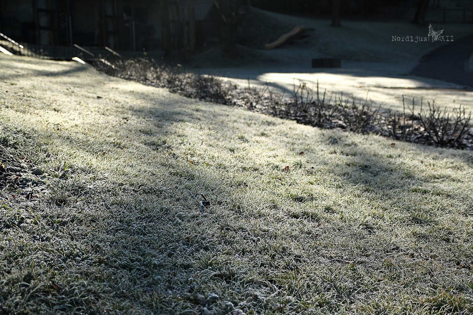
It's week 48 of Picture Inspiration already, and this week's prompt is "Winter Light". I had taken these pictures on the Sunday before, actually, but "winter light" was exactly what I had in mind on that early (well not that early, really) Sunday morning walk.
The moments of happiness we enjoy take us by surprise. It is not that we seize them, but that they seize us. (Ashley Montagu)
So, four weeks left to go. Taking a look at the statistics in the classroom gallery, I managed to take/post a total of 29 pictures for 25 of the prompts, and the last one I posted was in week 40 (two months ago? Really??). That makes it just slightly more than half of the prompts. It's more than I thought, actually, but much less than I intended. But I'm really really determined now to complete the last 4 prompts now.
The days and weeks just fly by at the moment, and I have so many things I want and try to do, that I never quite seem to manage to keep up with everything, as with Picture Inspiration. But although I've been bad with keeping up posting, both here and in the forum, I have been taking pictures all the time. So here's a bit of a catch up of the last four weeks:
Week 37: Texture love. In week 37 we were exploring textures, that is post processing photos with the use of texture images. Which is something I love and have been doing a lot, even though not so much recently. The mist on that Saturday morning made the shore on the other side of Lake Zürich completely disappear, leaving the little sailing boats looking a little lost and giving the whole scene a sort of timeless feel. I used three different textures to enhance this feel, two by Shadowhouse Creations, and one by Flypaper Textures.
Week 38: A Delicate Balance. The task was to find a delicate balance between image and texture. It was a grey morning, and I loved how the mist hung in between the colourful trees. However, the original picture was rather bland and boring, and needed some processing to bring out the colours. Apart from the usual levels, saturation and light adjustments, I used a subtle texture by Shadowhouse Creations to make the autumn colours shine and to add to the texture of the trees, without making the additional texture too obvious.
Week 39: Leaving Textures. We were leaving texture processing and were focusing on mere texture alone, which the season offers in abundance at this time of year. The leaves all around were of course perfect for this prompt. Not only are they in itself full of texture, but they cover the ground with a blanket of texture as well.
Week 40: Grateful Day. We don't have Thangsiving over here, but this does not mean that we don't have a lot of things to be grateful for, big and small, essential and trivial. So what am I thankful for? There are things I take for granted but which aren't really so self-evident, things that could be better - but also a lot worse, things I worked hard for and deserve, and things where I'm really just lucky, little luxuries that simply make me feel good. Among the last is the fact that, despite my job and long daily commute and all the other every day stuff, I still find time and energy to be creative. And it add so much value to my life.
We received the prompt for Week 41 yesterday. And this one is really going to be a challenge!
This week (week 35) at Picture Inspiration is all about the gorgeous pumpkin: Let us celebrate the gorgeous gourd!, Tracey declared, and wanted us to focus on "relationships" with our subject matter.
Now we don't have Halloween here, and so pumpkins aren't quite so "big" a thing as in other places. But we still like to use them as seasonal decorations, bringing the beautiful warm autumn colours into our homes with them. But we most of all love to eat them - as tasty, delicious, creamy, rich pumpkin soup (with curry, a splash of cream and some pumpkin seeds in this case).
I had a lot of fun with these pumpkins (and I'm sure I'll have lots more, as I intend to devote some of my weekend to the intense study of them, trying to sketch, draw, and paint them). I took so many photos that I risked the soup getting all cold in the meantime. I had a hard time deciding which photo to chose for the prompt, but finally went with the one above - and made a little collage with the rest :).
And I got to enjoy my lovely soup. It was delicious (and still hot enough). My relationship with my subject? - Very satisfying! :) Now I'm really looking forward to the weekend and to bringing those shapes and colours on to paper.
And I really intend to keep up with Picture Inspiration. I've been trying to, but didn't do a very good job so far, I'm afraid. I've posted some pictures in the group pool, have taken some more but never got round to process, let alone post them, and with quite a few prompts didn't even manage to take a picture at all in the first place. It's less than 20 weeks to go now, and I will do my best to keep it up now for the rest of the course, and take and post a picture each week, both here and in the group pool. It should be doable, right!?
Last week's (week 31) theme for Picture Inspiration was "extreme crop". The challenge was to use a crop we would not normally do, would maybe not even think of. When I stepped into the church of San Giovanni Battista in Mogno, Ticino, last weekend, I knew I had found my challenge. And it certainly was a challenge, as the room was so stunning, I naturally wanted to capture it all.
And of course, I did shoot it all, inside and out. You didn't really expect me not to, did you? :). The Chiesa Di San Giovanni Battista (Church of Saint John the Baptist) is located in the small village Mogno deep up the Maggia Valley. It was built by renowned Swiss architect Mario Botta between 1992 and 1996, after an avalanche had destroyed the old baroque village church as well as a great number of houses in 1986.
It's a fascinating building, which stands out but still fits in. It is built of stone, as are so many traditional houses and buildings in the valley. The stones are white marble and dark gneiss, both from stone quarries in the valley.
It's a small church, with room for just about 15 people. But then, the village of Mogno is a small place, and today, not even inhabited all year round anymore.
The interior is plain and simple. But the grey and white and the lines form fascinating geometrical patterns and the rooms feels so bright and airy.
It's a special place, a magical place, even if you're not very religious.
The church has no windows, all the light comes through the round glass roof, bathing the interior of the church in the light of sunny Ticino.
The light and shadows add to the geometrical patterns, forming new, dynamic lines on the walls.
We spent quite some time there, in and around the church. But eventually, we had to leave the place, as we had a train to catch later on. So off we drove, but took a quick stop further down the road, to cast one last glance at the place.
It was a wonderful day, and a wonderful weekend, and hopefully, not the last time I visited this special spot.
I have signed up for a new course at BigPictureClasses (well, it actually started 2 weeks ago, but as usual, I'm behind...), a different course this time than the courses I've been taking in the last few months - courses on photography, mixed media art, scrapbooking (which I discovered that it isn't really my thing but which led me to mixed media, which allows me to put all those wonderful patterned papers and stamps into good use), photo post processing, generally getting creative etc. This course now is about writing. Journal writing, to be precise. I'm not a great journal writer, never have been. I haven't got piles of pink journals filled with my teenage thoughts, fears, crushes etc. I have a handful of travel journals and another handful of half empty journals, documenting my attempts of getting into to habit of exploring my life, analysing my inner self and creating memories for the future me through journaling. I'm probably just a rubbish interpreter of my inner self. I simply never got anywhere with journaling. But I've been quite envious of those who are great at pouring their hearts into their journals, having all those wonderful pages filled with memories to go back to.
I always enjoyed writing though. I used to be top of class in essay writing all through my school years. At the end of university, however, my confidence was crushed forever by the words of my professor, when discussing my master thesis with me: "Well, Ms B., writing just isn't your strenght". Unfortunately, these words are all that stuck, every praise and positive remark I've ever received during all of my many school years, and even after my masters degree (he accepted it, at least) where wiped out by those few words. Even when doing something personal as writing into a journal, I'd find myself sitting there facing the empty page, saying to myself, 'who are you kidding? don't you know? you just simply can't write!'.
But now, after all those years, I finally want to forget, or at least ignore, those words, and start to write again. However, there remains the initial problem, that I'm just not good at creating memories by filling endless pages in a journal. I just never go back and read them.
Last year, during a workshop, we did a test to find out what kind of learning type each of us was - visual, haptic, auditive, textbased. I expected that I learnt best by reading (considering I'm a bookworm, librarian, having studied lingustics and literature). As it turned out, I'm not. I'm the visual type (closely followed by text though), which, when thinking about it, actually makes a lot of sense.
Art journaling, something I've only just recently discovered, therefore seemed to be the perfect solution. A visual memory, with just some few significant (what a great word!) to complement them, making it the perfect memory for me to remember. But oh, how often did I find myself sitting there, nib pen ready in hand, struggling to find the right words to jot down, getting up to make a cup of tea, coming back, head still empty of the right words, afraid of ruining my page by getting too many or too few words, phrases, lines, on the page, messing up the whole balance of my work. And ending up with just the 'art' bit, missing it's 'journaling'.
And that's where the writing class comes in. I haven't actually quite gotten round to doing the writing exercises, to be honest, but I definitely intend to do them. After all, there's no hurry. All in it's own time. I have been reading through all the pages of the handouts and prompts and assignments, though. And I realised something. Nothing great, just a little thing. But more often than not, it's those little realisations, which probably, are quite obvious to everyone else, but which have been bothering us, annoying us, frustrating us, until, at last, the solution strikes us quite unexpectedly, and everything becomes clear. And that's exactly what happened.
The thing is: I don't have to write the journaling part down right t here and then, nib pen in hand, expecting the perfect words to just flow out from my brain right into my hand in the perfect journaling, all effortlessly, and easy. Instead, I can write it all up on my computer, play around with it, rearrange it, shape it, until it looks right, print it out, and then, nib pen and ink bottle ready, just copy it on to my journal page. 'Well, yes, why, of course, isn't it obvious??' You might be thinking right now, when reading it. It is actually is rather obvious. So why, I ask you, or rather myself, haven't I thought of it before??? It would have made my journaling life much easier these last few weeks. But at least, from now on, it will. At least I seriously hope so!
And although I'm not the auditive type, a little background music can be very inspiring, calming, encouraging, when writing or painting, so here's what I like to listen to when I'm creating (or reading in the train in the mornings), one of my absolute favourites, Vivaldi's Concerto in B minor RV 580 from the L'Estro Armonico collection (I love violins, and I love the minor keys). It's not the best quality, but I liked this version, and the b&w just fits perfectly. (Click here for another, newer version).
I just realised that we're actually already in week 16 - and there's me, thinking that I'd finally managed to keep up... Well, I still have time till Thursday to take and post a picture for this week, but here's last week for now. The theme was "double vision", looking at a subject from different perspectives, shooting it from up and down and creating a diptych.
It's early summer (how time flies!!) and this means it's poppy season. Yay! I just love poppies. They're so cheerful. One of the meanings of red poppies in the language of flowers is pleasure. And they're certainly a pleasure to look at. They just always make me smile!
A little bit, at least. We're already in Week 15 (how time flies!!), and so far, I actually managed to do and upload a meagre three images. High time for a bit of catching up! I'm cheating a little bit, though. Instead of going to take the pictures, I'm going through the pictures I recently took, looking for some fitting the topics. There are quite a few that match pretty well, so I think that's quite okay, actually :).
So here's a little catching-up on some of the themes:
Week 4: How Things Stack Up
I tidied up the kitchen cupboard, and decided to store these bright green and light blue coffee cups and saucers in the basement, as they're never used anyway. I'd need some cardboard box to put them in. I just recycled a whole bunch of cardboard boxes two weeks ago. Isn't it just typical?!
Week 10: Dishing It Out
I think I actually took this picture especially for this prompt. My kitchen. I seem to spend an unproportionally great amount of time with washing up the dishes. I really don't know where the stuff's always coming from. And I really wish I had a dishwater... But at least it's all bright and colourful in my kitchen :)
Week 11: In the Distance
When I was standing up there, taking pictures of Schloss Schönbrunn and the city of Vienna behind it, I thought that the big church in the far distance was the famous Stephansdom. It was only when I was looking at the pictures more closely back home again, that I realised it wasn't, but some other church. Well, I have no sense of direction, and I'm shortsighted... :)
Week 13: From the Ground Up
Lovely daisies in the beautiful park of Schloss Schönbrunn in Vienna. It was a very hot and sunny day, and the cool woods was very welcoming.
A variaton of the theme:
I very much prefer to watch these from the ground up than being up there in one of the little cars for sure!
Week 14: Bird's Eyes View
Not a bird's eyes view, but what a bird up in one of those branches would see, when looking down on the Burgring on a rainy day in Vienna.
I really liked those water puddle reflections, which were a bit of a consolation for it being such cold, grey and rainy day when I arrived in Vienna the week before last. And I had the theme in the back of my mind, so I took quite a few of these shots :)
And from a real bird's view perspective:
Landing at Zurich Airport on a grey and rainy day. I've got such a terrible sense of direction (and geography) that I'm afraid I can't even tell which town this is. But it looks cool from up there :).
I meant to post only one picture per theme, but somehow, it turned out a lot more. I've just got so many pictures, and sometimes, I simply couldn't decide which one I liked best. There's still a lot of catching up to do. I've been struggling to keep up with all of my 52 projects, and it's been quite a busy past few weeks, but I still intend to catch up with all the past themes after my holiday in June/July, and keep up with it all for the second half of the year :)
Now that I have my camera back, I'm trying to catch up with everything I missed in the last 3 weeks. We're now in week 6 at Picture Inspiration, and so far, I managed exactly two of the prompts (i.e. week 1 and 2). Today, I read through the weekly inspiration message for this week, and realised that I had just the perfect photo for this week's prompt "seeing double".
I went on an early morning walk around a lake nearby and the surface of the lake was so calm and smooth that the woods along it were perfectly reflected on it. The colours aren't exactly very pretty at the moment, with everything still rather brown and bare and only just starting to turn green and coming into bloom, so a little bit of post processing experimenting was perfect with these shots. In the above picture, I tried to achieve a vintage 1970s effect, following an e-course lesson.
In the image below, I used a scratchy texture technique to enhance the "old black and white photo feel".
So there are still weeks 3, 4 and 5 to catch up. Hope I'll manage over the weekend :-)
Oh my, I'm so annoyed and frustrated at the moment.
At the very end of last year, I came across the One Little Word class at Big Picture Classes and immediately signed up because it just sounded so great and inspiring (inspiration being my word for 2011). It's a year long class where each month, you focus on your chosen word by creating a collection of images and stuff connected with your word which you all put into a pretty folder. So by the end of the year, you'll have a folder full of stuff about your word and a pretty keepsake to look at again and again. I especially liked the fact that you were working with differently sized layouts which you could download and fill your stuff in and print out and which all fitted into specific page protectors.
My enthusiasm was quickly dampened a bit when I clicked on the links on the supply list. All the three basic things - the album, the lovely thick paper and the page protectors - were all not in stock at the big online store scrapbook.com (I'm deliberately not linking to them as I'm so annoyed with them at the moment). Okay, so I clicked on the "notify me when in stock" button and started working through the handouts, patiently waiting for the supplies to become available. At one point, one of the things was in stock - for about a day or two, then the next and then another. With shipping costs a minimum of $40, there was no point in ordering everything separately. But unfortunately, the three things were never in stock at the same time. At the end of January, I finally managed to order at least two of them, the album and the paper (and some other scrapbooking stuff) and I kept on waiting for the in stock notice for the page protectors.
After having waited for well over three months now, I tried to look up the product in the shop. I typed in some keywords and couldn't find anything. So I went back to the class supply list and got rather suspicious when I saw that the link was now gone. Instead, there was a sentence encouraging us to use our own supplies if we didn't want to buy the suggested material. After some researching I discovered that the page protectors had been discontinued. And obviously had been so some time ago, as they weren't even listed anymore in the shop. I was so annoyed that scrapbook.com never bothered to let me know that the product was no longer available (after all I had requested an in stock notificaton by e-mail), let alone suggesting an alternative.
I'm also frustrated because the class goes on with the materials being based on those page protectors. The "we encourage creative adaptations. None of the exact supplies are required to participate in the class" stuff is really not much use if you don't have a choice. I actually wanted to use the exact supplies. It had been one of the things that had made the class so attractive for me that you could just concentrate on the content and didn't have to worry about layouts and about adjusting them, because you could just download the fitting layouts, fill in your stuff and print them out. I especially liked the folder with the many little pockets. You could print out pictures on little cards (or rather cut the paper up into little cards) and put one in each pocket.
But now I sort of feel left out. I can download the pretty layouts which most of them will be rather useless and I'm left on my own to figure out how to adapt them and make them fit, and all in unfamiliar American measures. I would have wanted to put all my energy into focusing on and working with my word rather than on adjusting layouts and on searching the mega store and trying to figure out which alternative to use.
My little word for 2011 is "inspiration", but at the moment I don't feel inspired at all, just annoyed and frustrated. And I don't really have any motivation to continue at all right now. I'm annoyed about having waited and waited and never having being told that the product wasn't available anymore (that's just poor service for me), about not knowing what alternative to use and about a class that is based on using a product that isn't available anymore.
I had really been so excited about this project when I started it, but at the moment I feel that it has just been a waste of money and time. I chose this image as my "beginnings" page. Because I wanted this year to be inspired to do all kinds of creative processes and projects and to spend more time with creating art, to find, or rather make, more time again for things like painting and calligraphy and so. Right now I feel that really, instead of wasting time at the computer fiddling around with layouts, I should really just get out the paints and brushes instead.
It seems that the "one little word" and I haven't been off to a very good start together. To be fair, it does say "for alternative ideas, check out the gallery and message board!". So there might be some useful information about alternative products and about how to use them instead but to be honest, I haven't had a look yet. Right now, I just don't feel like it. I just don't want to know anything about that whole business for the moment.
I'm sorry if that all just sounds very negative and all and about ranting on about it like that. I'll go and make myself a nice cup of tea now and see if I find some chocolate and try to calm down. I know that it's not really worth to get so annoyed about it like this. But there are times, when it's just these little trivial and insignificant things that get you down and make you feel miserable. I realise that I get annoyed and irritated about almost everything far too easily at the moment. I put it down to low iron level. I've been there before, and getting annoyed and irritated about anything and everything really annoys and irritates me no end. The problem is that it also takes your energy away to do anything about it, even the things that would make you feel better, like phoning your doctor to make an appointment. At least, it looks like that, after a good six weeks, the cause for it all seems to finally have stopped. But that's the problem with "chronic", it's never going to go away for good... But that's an entirely different story.
I've signed up for yet another course involving yet another 52 week's project, along with 52 of twenty eleven (where I'm again behind) and 52 weeks of no colour (where I'm just about keeping up). The new project is Picture Inspiration at Big Picture Classes. I enjoyed Picture the Holidays and Picture Winter but the daily prompts were a bit stressful and really just too much for me. But once a week should be manageable. I hope :-).
The course started last week and this (the second's) week prompt is rhythm. We were given a number of definitions and had to translate one of them into a picture. I chose the definition pattern of masses alternating with voids. I love bare winter trees (I only really came to appreciate them now, after I got my camera and finally learned to see), the mass of dark branches in all sizes and the voids in between them. I took the picture a few weeks ago, but I just thought it fitted the prompt so well and I did the processing today :-).
For week 1, we had to take a self portrait so that we could all see each other, as we are going to spend the next 52 weeks together. A good idea, of course, only that I don't really feel much like taking selfies at the moment. I have no energy at all right now (health issues...) and I'm tired all the time. I took some pics in the bath room mirror and then tried some b&w processing and added a framte, until I got a result I could halfway live with. I also added some Gaussian blur under the pretext of softening it up but it's really just an excuse to disguise the fact that the picture isn't really quite sharp but slightly out of focus.
Anyway, I'm really looking forward to the journey and I hope that I'll manage to keep up :-). I'm really happy about seeing many of the "girls" from Picture the Holidays and Picture Winter again in the new course and taking the journey with them. I know I'll find lots of inspiration in the class gallery. I also like the community spirit in these classes and I really hope that I'll manage to keep up with everyone's uploads and with commenting better than I did in the last two classes.
Today, I finally had the time and energy to give last week's assignment another go. (Friday - isn't it funny how much more energy one suddenly has when one knows that one doesn't have to get up at 5.30 the next morning?).
I decided to take only the full stops this time, though I included f/1.8, because my lens doesn't go any lower (f/1.4 would be the full stop).
Ha, no problems uploading it this time, and the large size also works perfectly :-). I just love to see them next to each other and to see how the DoF changes. Even with just the 9, instead of the full 24 stops, it does still look cool. Yes, I definitely have to do more of these, with different subjects and in different light conditions. Such good exercices :-)
Week 4 of Mastering Manual Mode already, and we continue looking at Aperture Priority. This actually has been my preferred mode for the last 10 months or so (and I completely ignored everything else, leaving for example ISO always on automatic). Time to really start to learn how all the things work together!
The assignment was to take a series of pictures with different apertures. Well, to be exact, the assignment was to concentrate on the full stop aperture, i.e. f/1.4, f/2.0, f/2.8, f/4.0, f/5.6, f/8.0, f/11, f/16. But I just wanted to try out the whole range of my lovely 50mm 1.8 lens, including all the fractions in between, so I went through the whole range from 1.8 up till 22. I took these inside, in my living room, and in the late afternoon, so it was already quite a bit darkish, hence the long shutter speeds.
But I think this is such a lovely exercise (and one I've actually had wanted to do for quite some time). Putting them all side by side, it gives you a great overview of the depth for each aperture. I definitely want to do this again in different light conditions. It's something you can always get back to. And I now have the mosaic template as well :-).
I tried to upload this last night, but without success. I'm afraid the quality of the picture isn't very good (anymore), which is why it's rather small here. This is because, math genius that I am, my calculations for the mosaic ended up in a file that was so huge that even with saving it with jpeg quality 0 was still far too huge to be uploaded. But I found a simple online image compression tool which allowed me to finally upload it: http://reduction-image.com/. Ah well, another lesson learned... :-). And as to the template, I'm afraid I'll just have to bin it and start the whole work all over again... :-(
In week 2 of Mastering Manual Mode we're looking at ISO and Program Mode. Program Mode is basically the next step up from Auto Mode (other terms I've heard or seen for this mode are "Idiot Mode" and "Muppet Mode" and I'm sure there are a few more :-) ). Unlike Auto Mode, in which your camera takes control of everything, there are a few things in Program Mode you need to be aware of - or rather where you can take a little influence, such as ISO.
The first assignments was to just take two different images in Program Mode. I didn't do anything as to ISO or anything else, just let everything on Auto. That's one of the two images, which I somehow quite like. I did some slight adjustments in PSE8, such as a layer with soft light (this has become a bit of a "must" really), some levels adjustment and a slight saturation boost. I also changed the colour of the text a bit, as the original is a rather too bright blue, which I toned down a bit.
70mm (17-70mm 1:2.8-4 lens); ISO 1600; 1/100; f4.0
* * *
The second assignment was to take a series of images of the same subject with different ISO settings and see how shutter speed and aperture change and how ISO affects the image. You can see that there's quite a lot of noise in the last, with ISO 6400. Which is not really surprising, is it :-). Again some slight levels and saturation adjustments, using exactly the same for all images.
As with last week's assigment, I created a mosaic to present them. I'm getting quite good as with using layer masks to create these :-). Only that I never manage to do the math right for the size of the background. So there's always a lot of resizing and moving around and final cropping of the background to make it all fit. I was always hopeless with math...
Last week was the start of the course Mastering Manual Mode at Big Picture Classes. I signed up for it because after 3/4 of a year with my DSLR, it was about time to master the basics. I changed to Aperture Priority mode very quickly and more or less mastered when to use which aperture for best results. Occasionally, usually for night shots, I used Shutter Speed Priority, but only rarely. ISO I usually ignored completely and let the camera deal with it. The only in camera adjustments I did was exposure but that was basically it.
So now, with the beginning of the new year and the beginning of my creative journey, I thought it was perfect time to get into Manual.
I did the first assignment last Sunday but when I wanted to process the images, I realised that I did it all wrong because, of course, as usual, I hadn't read the instructions properly. As we were supposed to take different images in and around our house in the daylight, I had to wait until today, my day off, to do it again.
The assignment was to take pictures of the same subject in different lighting situations, with the camera set on program mode and ISO to 400, and to make a note of shutter speed and aperture for each image. I processed each image in PSE8 with slight adjustments of levels and/or saturation.
It's already week 2 actually, and the next assignment is waiting. I'll be working on that tomorrow afternoon or Sunday - but this time reading through it properly first! :-)