Are you not too happy with the link buttons provided by other social networking services? Do you feel that they just don't really fit the design of your blog? Wouldn't you prefer them to match your style and design, and to express your creativity? Well, that's how I felt about them, and so I decided to play around a little bit with watercolour paints and Photoshop Elements, and see what I could come up with. I'm quite pleased with the result, and I'd like to share the process with you. It's really quite easy, so why don't give it a try?
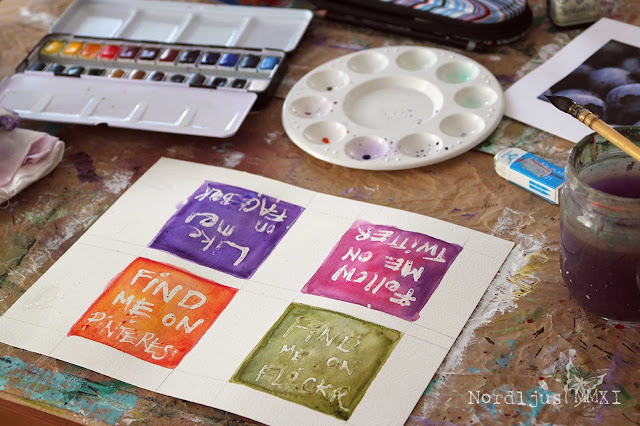
Start with a plain sheet of watercolour paper and draw as many squares as you need. I made them 8x8cm each, but it doesn't really matter what size you make them, just choose a size that allows you to write and paint on them comfortably.
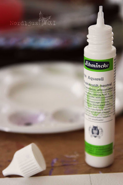
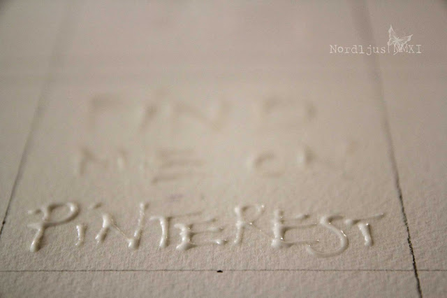
Then use some masking fluid to write the text into the squares. Masking fluids often come in bottles, and you can just dip your brush into them and apply directly on to the paper, giving you great flexibility as to thickness and brush strokes etc.You can also get them in bottles with some kind of applicator attached, which allows you to write with them directly on the paper (that's the one I used).
My bottle was a bit sticky on top and the fluid wouldn't come out at first. So I poked around with a toothpick, removed the cap, poked some more, put it on again, and gave it a good shake. With the result that I ended up with a whole puddle of it spilled all over my paper. If something like this happens to you too, don't worry. Just wipe the fluid away from the areas where you don't want to have it (it dries quite slowly so you have enough time). Take the bottom end of a brush, for example, and dip it into the puddle to write your text. You might just not get quite such an even look with this (as you can clearly see in my examples). Make sure that all the areas you want to leave white are covered with the fluid. Most masking fluids are white, but you can also get coloured ones that help you see it better when it dries transparent.
Let the fluid dry a little bit. It's okay when it's still a little bit sticky to the touch, but it should be solid enough, otherwise you'll just smear it around when painting over it, and your design is ruined. When you feel it's dry enough, take out your watercolour paints and start painting the squares with the colours you like. I actually made a little mistake - the colours for my Twitter button (I don't actually have a Twitter account I want to use right now, I just did one in case I'll decide to set one up soon) were actually intended for the Flickr button. Well, a bottle of coloured masking fluid is certainly on my shopping list :). But it doesn't really matter if some little mistakes happen, as these are your very own, individual designs, and really, you can make them however you want them.
The masking fluid rejects the water and protects the paper underneath, which allows you to cover the space freely with an even layer of colour, without having to fiddle around and trying to leave out the letters. It wouldn't really work anyway, and you can always tell. The brush strokes just aren't looking smooth and even.
Apply several layers and colours (letting them dry in between) until you're happy with the result. Then let the whole thing dry thoroughly. I know. It requires patience, but I'm afraid you'll just have to go and find something else to keep you occupied with. If it isn't completely dry, especially the masking fluid, you won't be able to peel it off. Also, a drier to quicken the process won't work here, as it will just soften the fluid again.
When it's dry, just rub the masking fluid off with your fingers. It comes off very easily, so be gentle. Your text appears underneath crisp and clean.
Now scan your sheet of paper, save as .tiff or .jpeg (or both), and upload in Photoshop/Photoshop Elements to resize and edite if required. You can either leave it in the original size and have it "shrunk to fit" automatically when you add it to your blog. This resizes it to 220 pixels in width on Blogger, for example. This is rather big though, I find, so a better option is to resize them the size you want, and upload it in that size. You might have to experiment a bit to find the size you're happy with. I had them resized 180x180 pixels, but I might want to make them even a bit smaller, as they're still quite big.
To upload the buttons on your blog, just go to Design >> Page Elements in Blogger and click on the Add a Gadget link top right. (Dashboard >> Appearance >> Widgets in WordPress). Upload your image, and add the link of your Facebook, Flickr etc. site you want it linked to in the link box. Add title and caption if you want to. (In Wordpress you also have the option to align your image and determine its size directly in the Widget upload box, apparently). Position your Gadget (or Widget) where you want it to appear on your blog - et voilà, you're very own link buttons, matching your blog design, colour scheme, and creative individuality.
I really enjoyed doing these, it was much simpler and faster than I thought. I'm sure I'll be making more of these things for my blog and keep changing them from time to time :). And I hope you find this little tutorial helpful and inspiring too. And if you like, come over and Like my Facebook Page, so that I'll eventually get a proper url for it :)


GENIUS!! Who needs blogging courses? That is so clever. I never would have imagined that's how you did it. This is just the sort of thing I would enjoy doing - probably not for the same purpose, but I like the idea of how the two different media react to each other.
ReplyDeleteSorry if I laughed aloud when you spilled everything (hopefully you didn't hear me!) I think these are the little things that make tutorials "human" and more fun!
Great blog (and new banner - blueberries?), and I bet loads of people will want to do something similar. You can turn your masking fluid handwriting into a font next!
so interesting to see how you made those. I love the soft water colors. thanks for shairing your process, I didn't know about using masking fluid.
ReplyDeleteI did that too, but i used pictures of old paintings and added text to them in Photoshop.
ReplyDeleteI like the handmade style of your buttons.
Hi! I'm a fellow Blogging Your Way student which is how I found your blog. Just wanted to say thanks for the inspiration!I love this idea! I love the look of watercolors but don't know how to paint- this looks like a project I could make!
ReplyDeleteso interesting and creative!
ReplyDeleteWhat an awesome idea! I had never thought of this.
ReplyDeleteLove your step-by-step tutorial. :)
Your buttons look great!
So nice to meet you through BYW.
All the best,
Mary
Mary C. Nasser Art Blog
What a great tutorial! I am very impressed with your creativity and "can-do" attitude. I may try when I have a chance... right now, I'm a bit afraid of WordPress. I think it might eat me. :)
ReplyDeleteThank you for sharing this tutorial of yours - it is very inspiring. I am not quite sure whether there are any masking liquids sold in my country (at least I have never encountered any), but I am definitely going to find out!
ReplyDelete