Wednesday, 29 February 2012

Fortune favours the bold

I don't think I've ever seen so many robins here than this winter. I kept encountering them on my winter walks, and I just love how bold and inquisitive (and pretty and colourful) they are. Not shy at all, as most of  the other birds, and therefore the perfect little photo models.


I've painted robins earlier this winter, but in the meatime, I managed to get masses of robin photographs, in all kinds of poses. I'll have to print them out, they'd be perfect to use for drawing exercises. And maybe some more image transfer experiments.

I think I should take those little creatures as an example, and Vergil's words to heart: Fortune favours the bold.

Tuesday, 28 February 2012

Green & purple, and simply irresistible eyeliner

This months colours for the Colour Challenge were lavender & green. And some texture thrown in for an extra challenge. When I did my journal page, I somehow had "lilac" in mind, rather than "lavender", and only relised it after I had finished it. But then lavender and lilac are a sort of purple, and it's all pretty similar, and anyway, after having done some research into green and purple (which happen to be my two favourite colours), and particularly the colour purple and all it's variations in a blog post almost a year ago, I don't really know anymore which shade is what.

So here's my colour study page about green and purple (or whatever you want to call it) for February. I love bamboo, and painted a lot of them during a green/bamboo phase a few years ago. The pansy really was just the first purple flower that came to my mind which wasn't too challenging to paint. I added some coarse and grainy modelling paste at the bottom of both pages to add some texture, but it doesn't show very well in the photo. I also added some stamps, butterflies and grass, for texture. The colours didn't come out so well in the picture, it looks much fresher on the page really.


Purple is the result of subtractive colour mixing of red and blue, it's complementary colour is yellow. It's geometric form is a combination of circle and square, its ranges from 450-396nm on the psecturm. At around 1500 BC the Phoenicians discovered how to extract purple dye from the purple murex (a kind of snail). Today, there are almost no lightfast purple pigments. Lilac and lavender are more popular than the powerful and rather unpopular purple, especially in older age. Purple is a difficult colour full of opposites and a range of different connotations. In astrology, purple is the colour of aquarius (maybe that's why I find it attractive!?).

Its connotations are: self-determination, (spiritual and secular) power, melancholy, imagination, connection, lust, height, eternity, depth, magic, modesty. Purple can give a feeling of narrowness, of distance, but it's darker shades can also have a calming effect, while lighter shades can be stimulating, and even intrusive. Introvert people favour purple because they can relate to the colour's tension between two opposite poles.

Green sits between yellow and blue, it's complementary colour is red. It's geometric form is a combination of circle and trapezium, it ranges form 550nm (lime green) to 500nm (turquoise) on the spectrum. Most green pigments today are based on chromium, many pigments such as verdigris are highly poisonous, and a whole range of greens are poisonous if the pigments aren't manufactured synthetically. The colour was immensely popular at the end of the 18th century, when many houses and rooms were painted and/or decorated with (poisonous) green. In German, ther are over 40 shades of green ranging between yellow green and blue green.

Its connotiations are: life, nature, harmony, paradise, trust, confidence, hope, vital energy, exuberance, growth, new beginning, jealousy, spring, poison, fertility, new love, balance, immaturity. Green is calming and balancing, harmonious, it strenghtens self confidence and self esteem. It especially appeals to people who are nervous and restless.

Some random (and quite interesting) facts from my little, rather esotheric, colour book:
  • men are attracted to women who wear purple, but also fear that they are liable to hysteria and have a strong tendency for individuality
  • if you have brown eyes, green eyeshadow will make you irresistible

    As it happens, I just bought some green eyeliner for a change two weeks ago. I have only tried it out at home, so far, and thought that it looked rather strange, really. But I'll get it out of the drawer again now, and give it another try. Irresistible. Hmmmm...

Friday, 24 February 2012

Playing around with image transfer

Still nursing a very persistent cold, but getting better slowly. But I didn't want to miss another Paint Part Friday, so I dragged myself off the sofa and into my studio to experiment a little in my art journal. I really like the technique of image transfer. I've learnt different techniques in different e-courses, and even bought a whole book just about image transfer. But my first attempts weren't really very successful. So today, I decided to give it another tr.

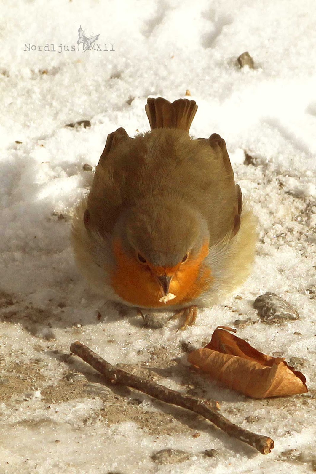
This is the image I chose for the transfer. I took this during a glorious winter morning walk. Well, I admit, it wasn't actually snowing that day. I added that later in Photoshop, but never mind...


I wanted to create an earthy, natural page matching th colours in the image. And what's more earthy and natural than Raw Umber, Raw Sienna, Burtn Sienna.


And in addition some Payne's Grey and of course Titanium White.


For the image transfer, I used gel medium. The first attempt didn't work at all. Although admittedly that was because I applied the gel medium to the wrong side of the image. Always remember: the gel medium goes on the printed side, NOT the backside... I decided to use the image after all and just pasted it on to the page.


The second attempt was much better. It actually worked! Okay, I admit, it does not look that great. But compared with my former attempts, this is actually very good indeed. Choosing similar colours for the painted layer underneath probably also wasn't such a good idea after all.

 At the bottom, I tried some image transfer using book paper. And that really worked very well.


I really like the book paper transfer. Though I'm never really 100 % sure when and if I've managed to remove all of the paper. It's delicate, this image transfer thing. If you rub too much, the whole printed part starts coming off too.


I decided to try and add some words. When transferring words, remember to invert them before printing them out, otherwise you won't be able to read them properly. That's obviously what happens when you transfer book paper, although I think it doesn't really matter much here, as you're not really going to read the text. But with words, it's another matter. It's also a good idea to cut off as much of the paper as possible. Less paper means less rubbing.


Patience isn't really one of my strenghts, but with image transfer, you have to be patient. When transfering on to a painted surface, you'll have to let it dry completely before you can wet it again and start rubbing the paper off. But also when you print out images, or words, you'll have to let the ink dry first before attempting to transfer them.

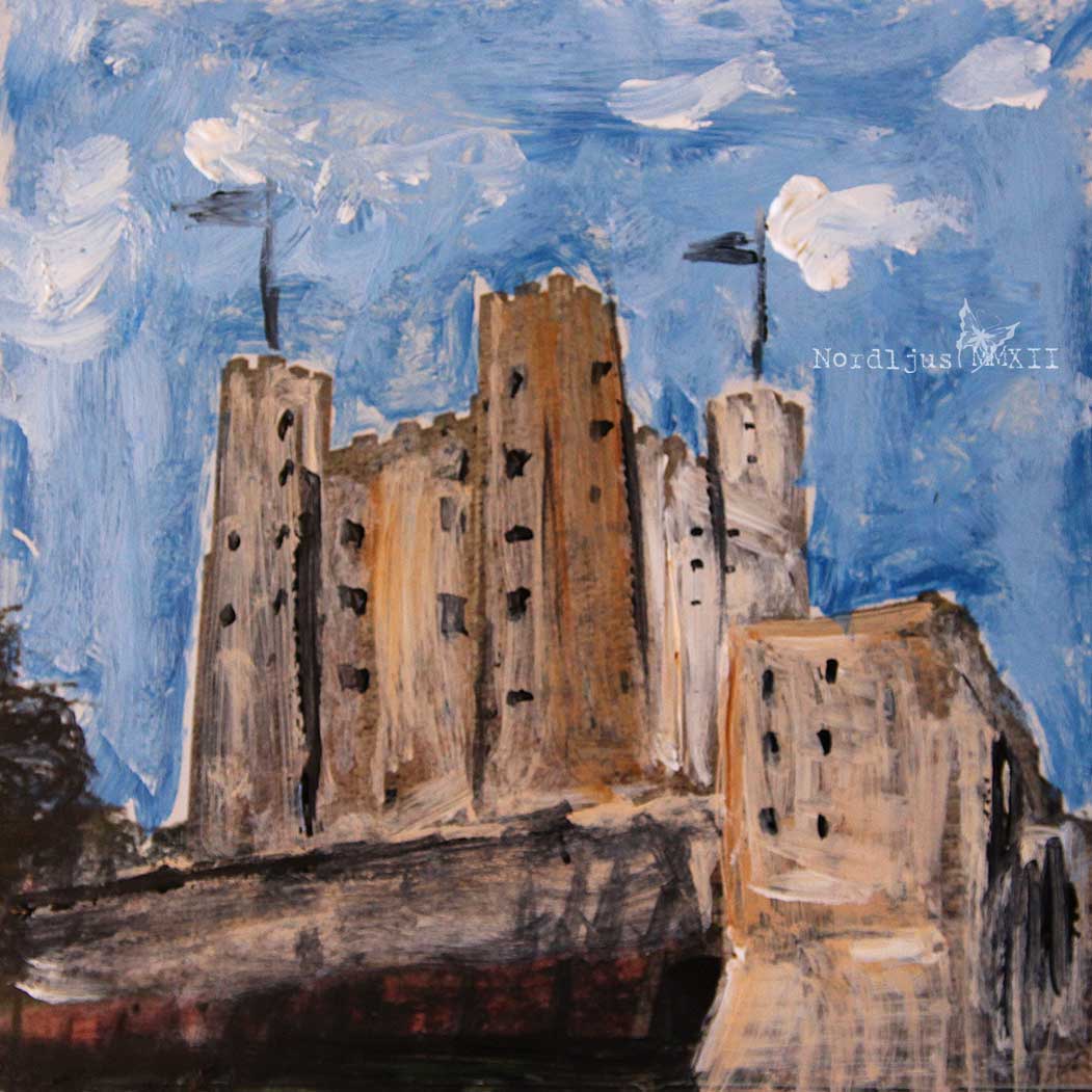
So I decided to play around with some photos in the meantime. I used an old photo of some English castle, cut it to a square format, and just painted over it with acrylic paint. I have a whole pile of old photos I meant to throw away, but now I'll hang on to them for experimental purposes. This is really fun :)


Of course I needed to extend my palette for this: some beautiful Cerulean Blue to transform that dull grey English sky into a bright blue summer's day.


When I was done with that, the ink was sufficiently dry, and I transfered the words on to the page to finish it off. I didn't manage to get all of the paper off at the end. The ink started to smudge when it got too wet. But I'm not too bothered about it. I think it works well enough. Maybe a laser printer would be better for this?


All in all, I'm quite pleased with this morning's image transfering. Not perfect yet, but I'll keep on experimenting.

My palette is getting a bit messy. Maybe I should give it a good clean. It doesn't bother me to work with it like this, but it doesn't really look so good on the photos, with all these layers...


Happy Paint Party Friday! Do hop over and have a look at all the talented and inspiring artists there!
Everything got into one long post this week, so I'm also linking this up with Palette & Paint. Do go and visit and see what everyone else has on their palette!

Monday, 20 February 2012

Runny nose, daytime tv & doodles

It's been going around for quite a while, and it really was just a question of time until it was my turn. And now it finally caught up with me, and brought me down, that nasty cold. So I've spent the last couple of days on the sofa, trying to find something decent to watch on the telly, and with life's essentials close at hand.


With daytime tv being what it is (I really wonder how many times Pollyanna has been repeated in the past few months?!? 100? 200? Certainly more than enough, as with pretty much everything else), boredom soon sets in. Thankfully, my sketchbook was close at hand. I wasn't in the mood to start another portrait, so I just thought I'd try some doodling. I've never been a natural doodler, really. I don't tend to draw patterns or whatever while talking on the phone (maybe because I'm not really a telephone person). Whenever I try to doodle (and I really tried hard last month, when doodling was the Sketchbook Challenge's theme for January), I usually find myself, pen ready in hand, staring at the white paper for a while, until I give up. I tend to think too much about what I want to sketch, draw, paint in order to just happily doodle away without thinking

But with an aching throat, watery eyes (mainly because of bad, boring afternoon telly), a slight headache (mainly from having to blow my nose about every 10 secons), and having blown half my brain out through my nose (or so it feels), doodling really seemed the only thing to do to pass the time.


I'm really starting to enjoy this doodling thing. I like using coloured pens, but I definitely prefer the simple black & white, just using pens with different tips, from very fine to broad. 

It's the third day on the sofa now. If this is going on like this, I'll have my sketchbook filled from cover to cover by the time this cold is over :)

Friday, 17 February 2012

Feathered friends, and all the beautiful things we can't see

We put a little bird house with birdseed in the tree outside our office, and now we're happily watching birds, and trying to identify them. It's definitely become busy and noisy out there. There's a couple of cheeky nuthatches coming to the feeder, and a few chaffinches, and a bunch of chirpy great and blue tits, as well as a sweet little marsh tit. Yestery, we spotted two new visitors, but haven't really been able to identify them. It's probably either a couple of siskins/black-headed goldfinches, or a couple of greenfinches.

I've also taken up going for walks during my lunch break again. There's fields and woodlands and the river, all part of a big nature reserve area, out there. I keep meeting a bold little robin on my walk, busily picking away at whatever he finds there on the ground. He gives me those side glances - keeping an eye on me in case I should get the idea of stealing his lunch, but otherwise isn't very bothered about my (close) presence. I've started to take some bird seeds with me in order to try to win his trust and get even closer :).

Now that all the trees are bare, I finally saw that beautiful great spotted woodpeckers I've heard so many times in the parks. He's certainly a beauty. There's also a couple of elegant, but very shy great egrets or great white herons around. Most of the time, I would have passed them without even noticing, but they're so shy that they take flight even when you're still quite some distance away. But the most beautiful of the birds around here is probably the stunning kingfischer, with his iridescent turquoises and oranges. I've only seen it once, down at the river. It was really more of a turquoise flash zooming past, glittering in the sun, just about identifiable as a bird, but truly beautiful.

I didn't have any time at all to do any painting this week. I was hoping to find some time tonight, but Inow I'll be too busy too. So, very heavy-heartedly, I even have to give the Paint Party a miss today :(. But I thought that I could at least do some little drawings of the birds, together with some notes, into my little Moleskine notebook I always carry with me.


Oh dear, I think I'm turning into a birdwatcher!! Well, that's the kind of thing that can happen to you if you're working in a remote, secluded and often pretty quiet place out in the sticks, with nothing but birds and squirrels around...

Btw, the beautiful and already very colourful plumage of the blue tit apparently has a very distinct pattern in the ultraviolet range which we humans can't see. It makes me wonder what else, how much there is out there that we can't see. Our seemingly colourful world might in reality be very bland indeed...

Thursday, 16 February 2012

Think before you pin

I’m sure many of you know Pinterest, and are using it more or less often and enthusiastically (the word „addict“ seems to pop up again and again in connection with Pinterest). Me too, I like using Pinterest a lot, and, as many other visual persons too, I’m sure, I just saw all those wonderful pictures and re-pinning is ever so easy now, isn’t it.

But a few weeks ago, when trying to trace the source of a particular pin, I noticed that so many of the pins I had re-pinned didn’t really lead anywhere useful. Certainly not to their original source. Most lead to some Tumblr site or other, more often than not one you couldn’t even view without signing in. Some lead to a blog (which gives/is the original source of the image) but more often than not, the link was just to the blog, instead of the post, so finding the image in question was often almost impossible (unless you have time to spend half of the day scrolling through blog post after blog post…). But worst of all, there’s a great number of pins which don’t really lead anywhere at all, but just to the image itself, and nothing more.

So rather than happily pinning away and collecting, organising and sharing all those beautiful and inspiring images, I have now spent the last two or three weeks going through my 3000+ pins to trace sources and delete those who didn’t have one. I must admit I have lost my former enthusiasm for Pinterest a bit. When I visit Pinterest now, I feel that I spend most of my time there clicking from link to link of a particular image only to find myself out in the nowhere. Maybe the problem is the re-pinning option. As I understand it, the main idea of Pinterest was that it allows you to make a visual bookmark of a certain internet source, just as you would with the bookmark option of your browser, or a provider like Delicious. But the re-pin button means that it’s so easy to share and spread all those beautiful, tempting images that others have found everywhere in the big wide internet, and the link to the source of the image, well, it get’s far too easily forgotten. And with it the credit for the fabulous works of many artists, photographers, designers, or otherwise creatives and the efforts they have put into their work. And that, really, is a pity a shame unacceptable.

I once had a picture of mine stolen on Flickr, when I was relatively new there. It was so frustrating to see someone else pretending that it’s their own creation while it’s actually yours, and taking the credit for your work and effort. Well, the Flickr case was easily solved. After the guy simply ignored all my messages asking him to remove my image from his stream, I contacted Flickr and they removed it. But after that I started to use watermarks on all my pictures I put on the net. Don’t count on others to respect your intellectual property, because there are many people who don’t bother the least bit about about it, so it’s up to you to make sure you get the credit for your work you deserve. But actually, there are also a whole lot of people out there who are concerned about proper credits, and who want to know who’s behind a certain image, even though the proper link or source has been *lost* somewhere in the tangle of data of the www, and a watermark can help them to trace you.

It is a pity that there are now so many great images out there on Pinterest which have become “unusable”, or “un-re-pinnable”, because of that. Last time I was on Pinterest, I found that about one or two out of the 10 or more pins I wanted to pin actually had a proper source link and therefore made it into one of my boards. The rest, I had to let go, with a great sigh, because they were oh so pretty and inspiring.

LINKwithlove

Well, enough said. Best read this blog post by Kal Barteski over on  [I] LoveLife about how to properly pin on Pinterest, it describes it so much better than I ever could. And while you’re at it, hop over and have a look at Link with Love, and grab a button to show that you respect intellectual property. Spread the word!

I still have to go through all my boards to remove images that have no proper source links, and it may well take me ages, but I’m working on it. The next step might be to un-follow those pinners who repeatedly pin from wherever they find their pins (Tumblr, mostly), and to only follow those who care about what they pin. It’s not always easy to get it right 100%, the internet can be a great and confusing jumble, but you can at least make an effort and try to do the right thing.

I wonder how many of my 3000+ pins will be left once I’m through!!

Friday, 10 February 2012

Paint Party Friday 48*6 ~ roses & thorns

I finished my journal page last night, the little rose girl. The roses are from an old book about roses I bought at a second hand shop. It has these beautiful illustrations of all kinds of roses on extra pages pasted in. I must admit I always feel slightly guilty when ripping the pages out, but are so lovely and I do put them to good use. At least that's what I tell myself. I used them both underneath the paint, with a whole page pasted down before adding the colour, and as cut outs to add at the end.


I also found a butterfly lying around on my desk. I had cut it out some weeks ago for another page, but hadn't used it. Sometimes it's good if you're desk isn't too tidied up ;)


The page turned out to be about thorns and roses. About the good and bad things we encounter on our journey that is our life. It all depends on the balance. And your attitude.


A very happy Paint Party Friday full of roses!